Hallway Update
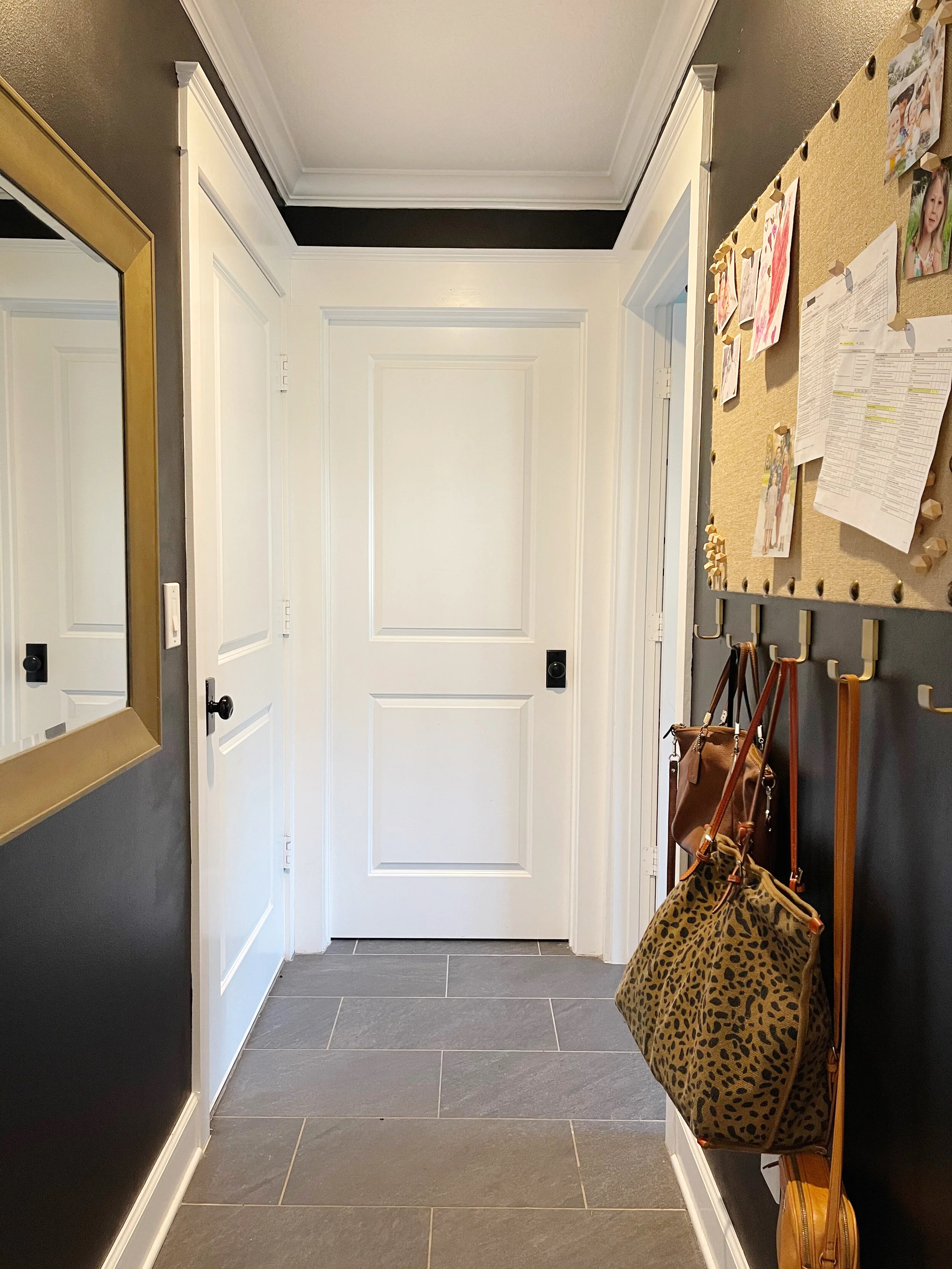
We have a small hallway that goes from our garage to our kitchen with doors to a utility closet and the laundry room. It ends up being a place where purses and backpacks line the floor. I had a small shelf with hooks but it was always overloaded and junked up. I decided this space needed some updating!
To be honest… I had can of black paint in the garage from when I painted my laundry room with Dalmatian spots and figured, hey, one less trip to Home Depot, I’ll just use this up!
I used to have a mirror in this hallway but decided to use it in Amelia’s room and turns out, I really missed having that mirror there. It’s nice for a quick check when heading out the door to make sure you brushed your hair, etc. I had this one in the corner of the garage so it was meant to be.
I’ve been wanting to a place to pin up the girls’ artwork and important papers so I grabbed this bulletin board and push pins! I like that it’s covered in burlap with the nailheads to add a cute touch instead of a plain old bulletin board.
I also found these brass hooks on amazon to hang purses and backpacks on! I love how they contrast the wall.
This was a simple project, but I feel like the paint a little details make it a much cuter space!
Home Edit Inspired Pantry Organization
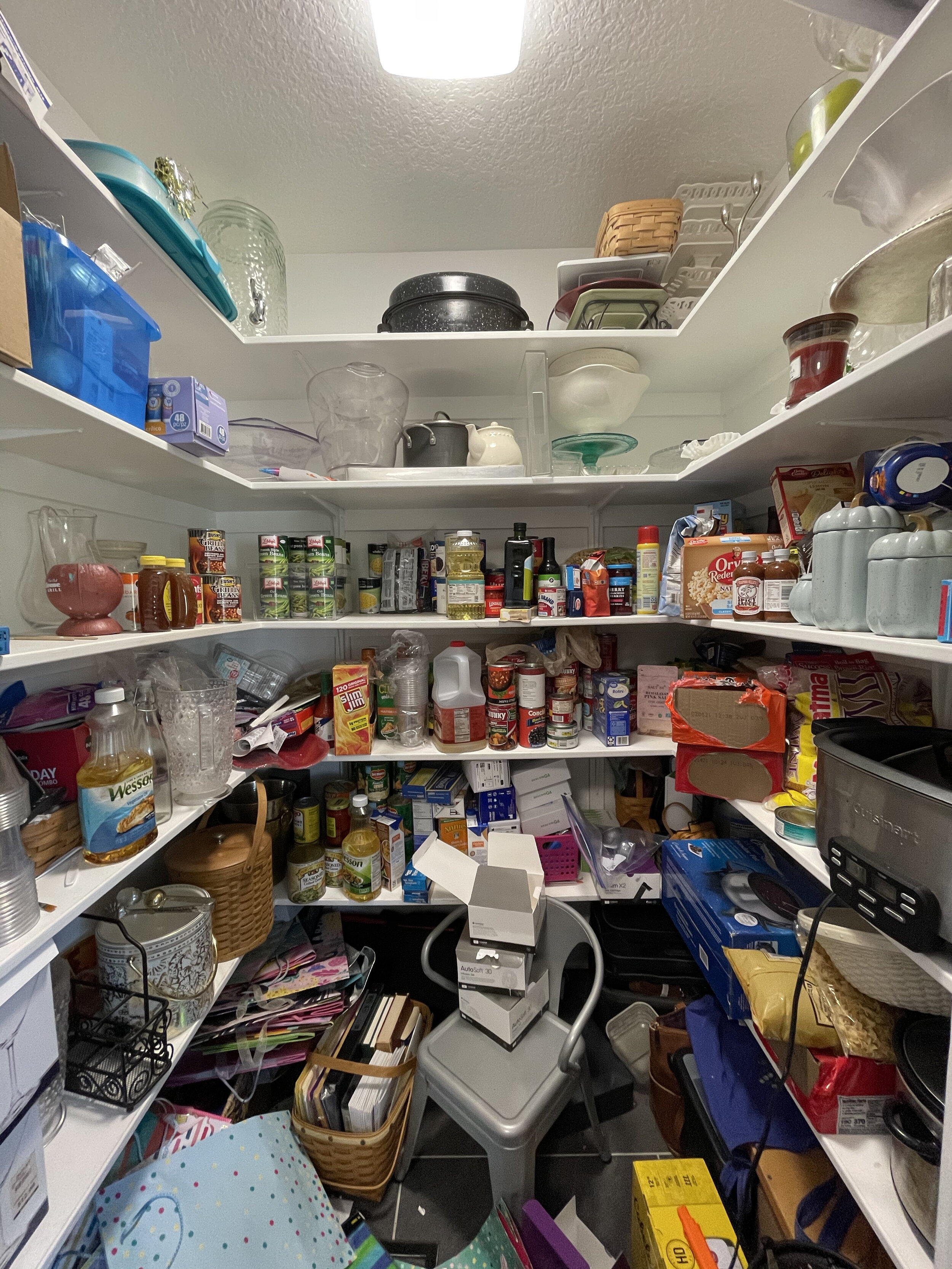
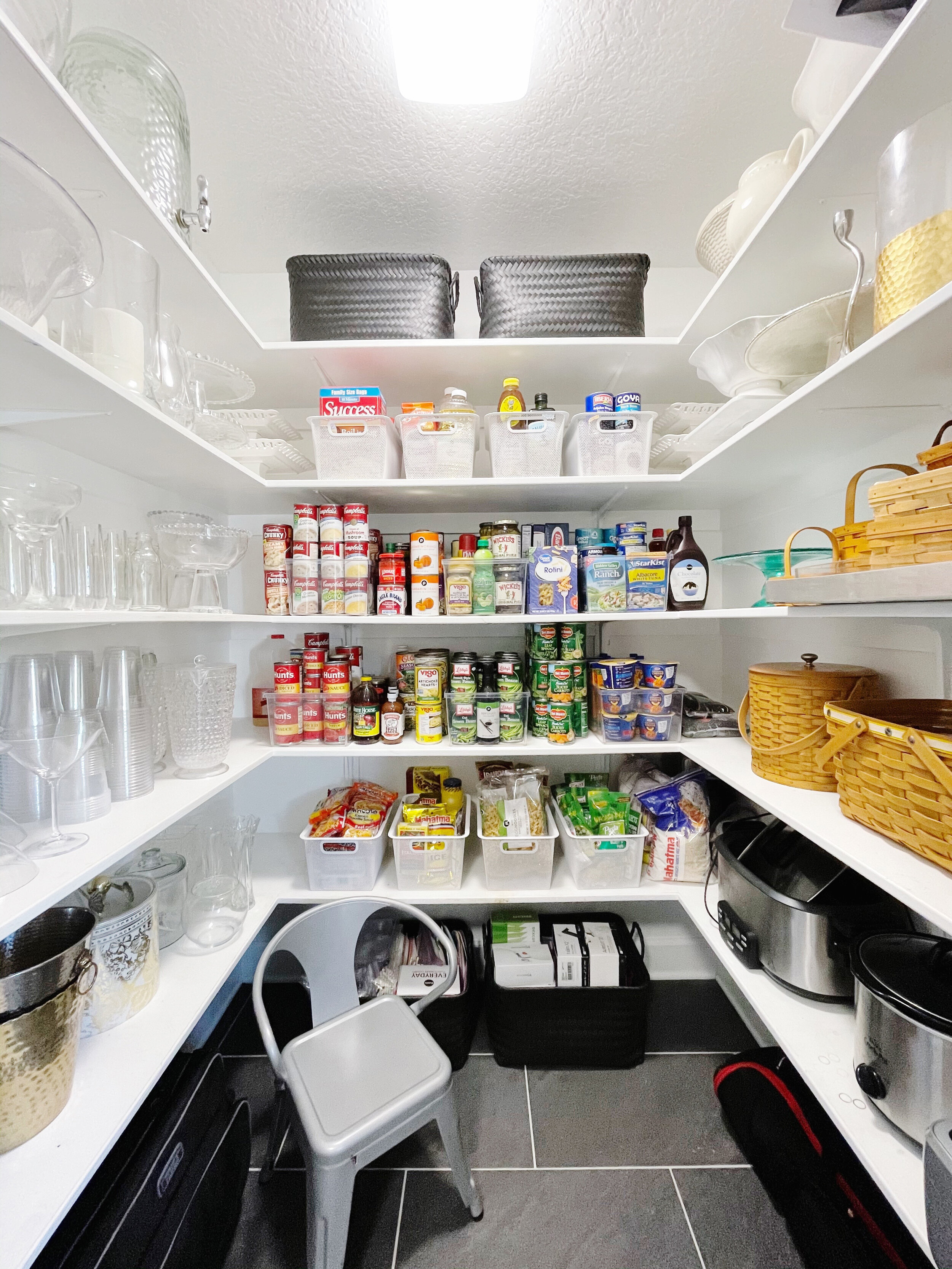
I recently came across The Home Edit on Instagram and I know, have I been living under a rock? Let’s just say HELLO INSPIRATION. I instantly felt the need to organize something. The worst area of our house was definitely our pantry. I couldn’t even walk in the little room. When I look at the before pic I’m more overwhelmed than I was when I was doing it. So much stufffffff.
Happy New Year! Who’s ready to get organized?!
I recently came across The Home Edit on Instagram and I know, have I been living under a rock? Let’s just say HELLO INSPIRATION. I instantly felt the need to organize something. The worst area of our house was definitely our pantry. I couldn’t even walk in the little room. When I look at the before pic I’m more overwhelmed than I was when I was doing it. So much stufffffff.
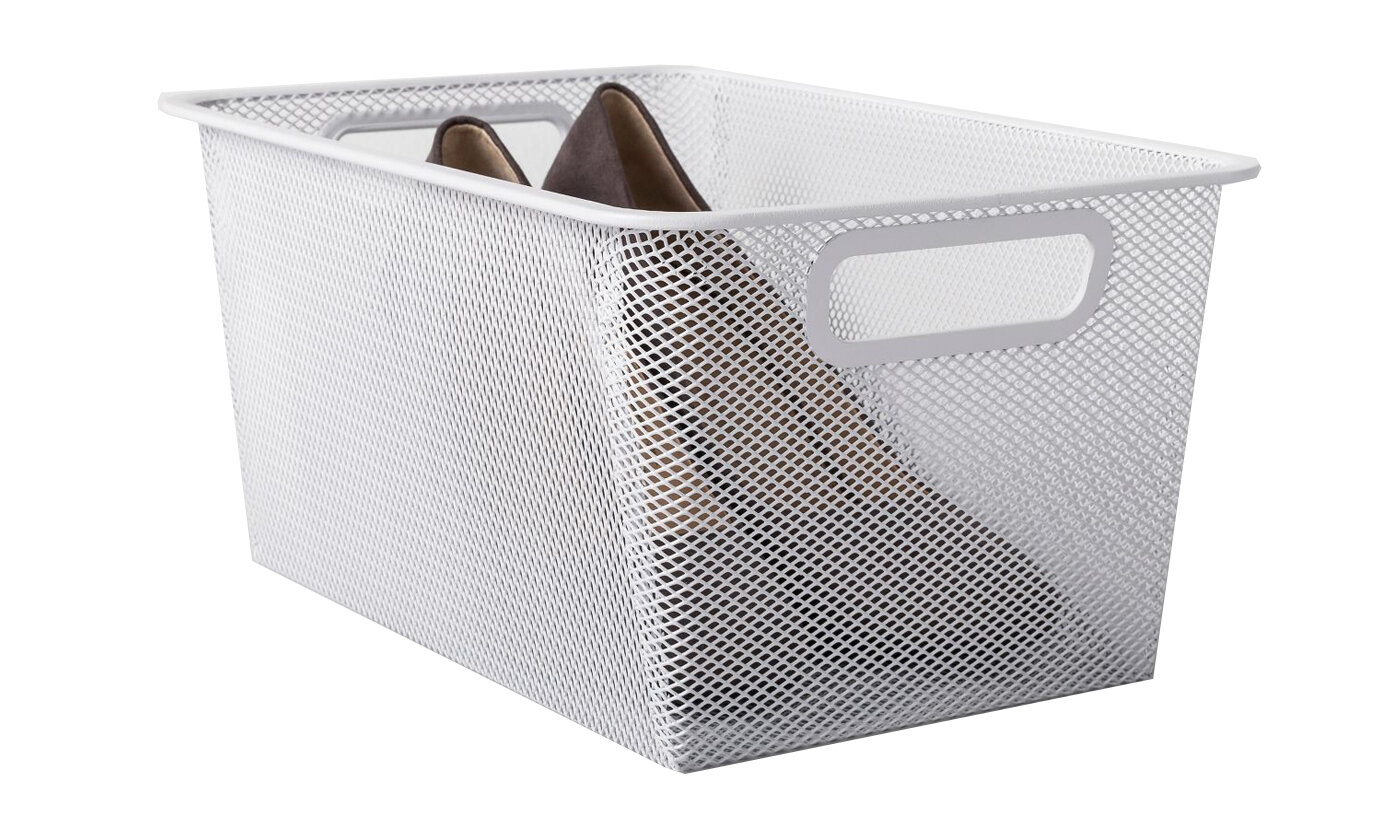
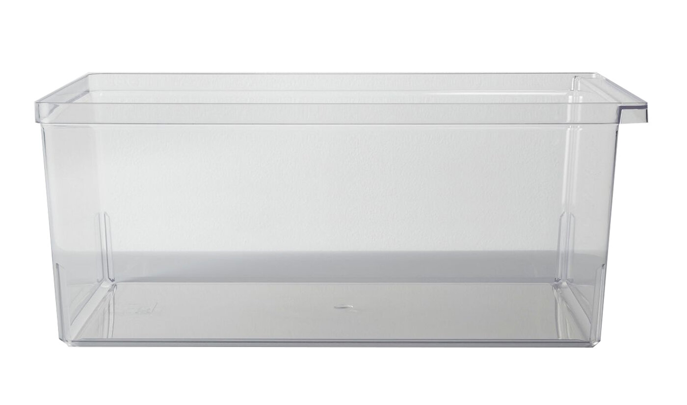
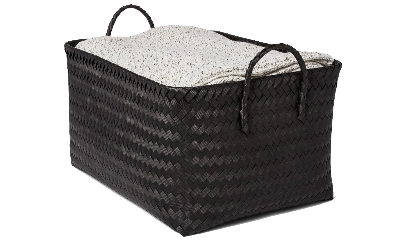
I knew I wanted to get some organizational products like bins and baskets. I hit up Target and ordered a variety of options to see what would work! I ended up with the following and i think they worked out perfectly! Click the images to be linked to the items on Target!
Playroom Design Update - Big Kids Playroom
Ahh the playroom. It was one of the things I was most excited about when we renovated this house over five years ago. A room, for all the toys to live, where you could just shut the door and forget about the mess haha. During COVID quarantine this room got a little out of control, mostly because there wasn’t enough room to put stuff away… or was it the fact that we had too much STUFF?
Ahh the playroom. It was one of the things I was most excited about when we renovated this house over five years ago. A room, for all the toys to live, where you could just shut the door and forget about the mess haha.
During COVID quarantine this room got a little out of control, mostly because there wasn’t enough room to put stuff away… or was it the fact that we had too much STUFF? We decided to go through the closet and really try to get everything INTO the closet. We got rid of some stuff they no longer played with organized what they wanted to keep. We got almost everything into the closet except the American Girl Doll house, woohoo! We decided to relocate the bookshelf into the playroom (from Amelia’s room) and put ALL of their books in one place.
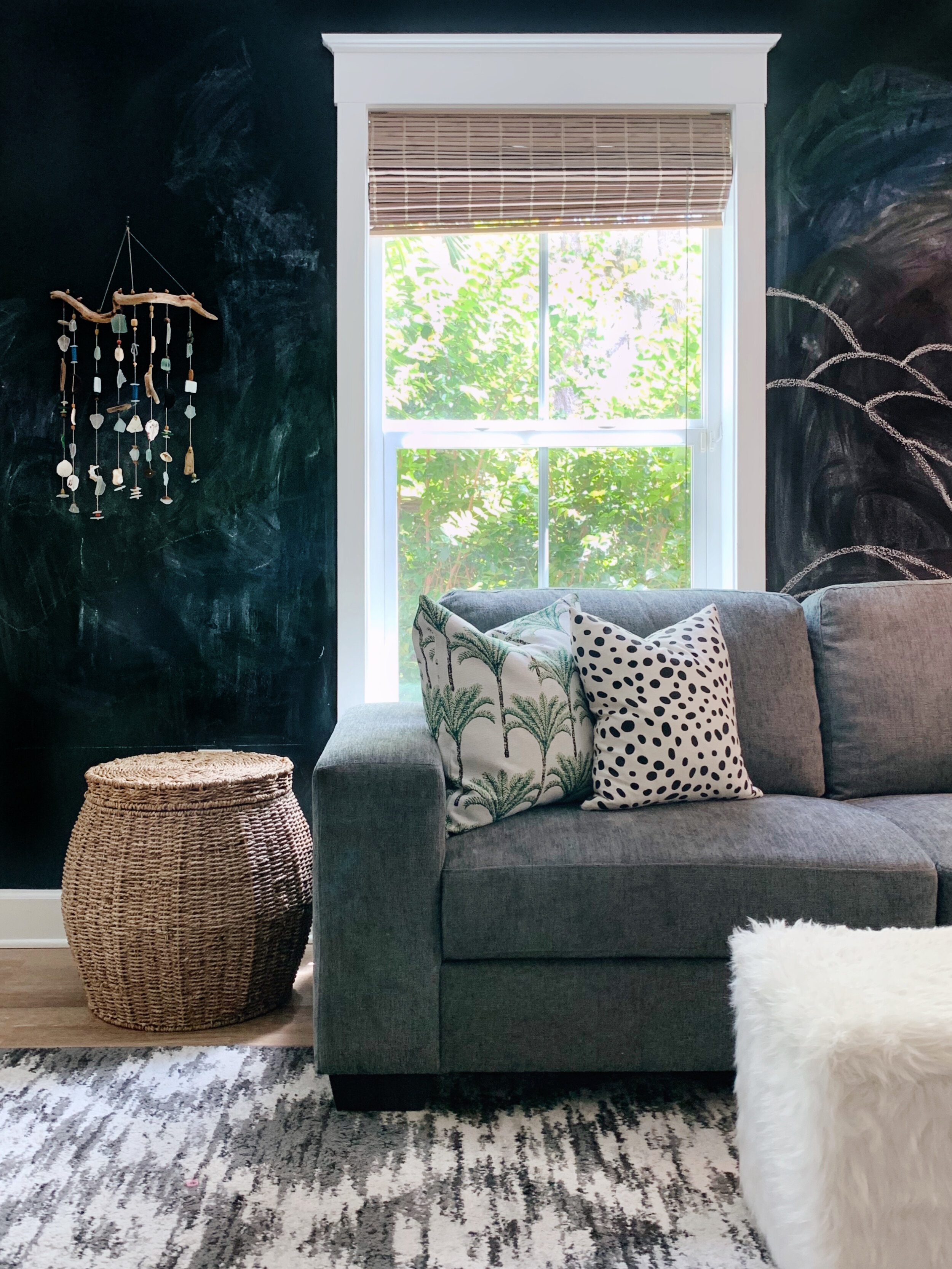
The truth is… the kids don’t play with toys like they used to and I wanted to make this room be a place they’d want to hang out with their friends. We decided to add a sofa! They can hang in here to watch movies, play Wii or Switch or use the open space on the floor to play with their American Girl dolls or Legos.
At night the room was pretty dark with only one lamp so we added a couple hanging seagrass pendant lights that I think look so beachy and cute. We repurposed a few storage cubes and baskets to stash blankets and stuff animals in (my girls are semi-hoarders with the stuffed animals).
I think we accomplished the task at hand, to make a sweet, big kids playroom that they actually like to hang out and play in!
Sofa | Rug | Green Pillow | Rainbow Pillow (similar) | Dalmatian Pillow | Palm Tree Pillow | Bookshelf | Pendants | Storage Cubes
Master Bedroom Refresh
There’s nothing like a quarantine to make you look around and want to redo every single space in your house, am I right? I have been wanting to get a new rug in our bedroom room for awhile. I never intended to use the dark grey shag rug in there but it worked for the time being when we got a new living room rug that went better with our sectional.
There’s nothing like a quarantine to make you look around and want to redo every single space in your house, am I right?
I have been wanting to get a new rug in our bedroom room for awhile. I never intended to use the dark grey shag rug in there but it worked for the time being when we got a new living room rug that went better with our sectional. Shag rugs kind of give me the creeps. It feels impossible to keep them clean, stuff like earrings and coins get lost in them and the amount of dust the rugs must harbor is probably incredible. Not that I need an excuse for getting a new rug, but these are definitely some reasons for the change.
So what started with a new rug quickly began the search for a new duvet, quilt and pillows. I usually start my search on Pinterest… I find a “look” I want to emulate and go from there. I kept being drawn to a particular rug and I thought it was interesting because it wasn’t really my usual “style.” I’m such a neutral gal and this was pretty colorful, for me. I decided to just do it.
Now onto the bedding… since the rug definitely makes more of a statement I knew the bedding should be pretty neutral. I’m a huge fan of white bedding but it’s just, scary, especially with a new puppy. I fell in love with this quilt from Pottery Barn but it was pricey, so I sat on it for awhile. When I found a super reasonable duvet cover from Target, I justified the quilt splurge.
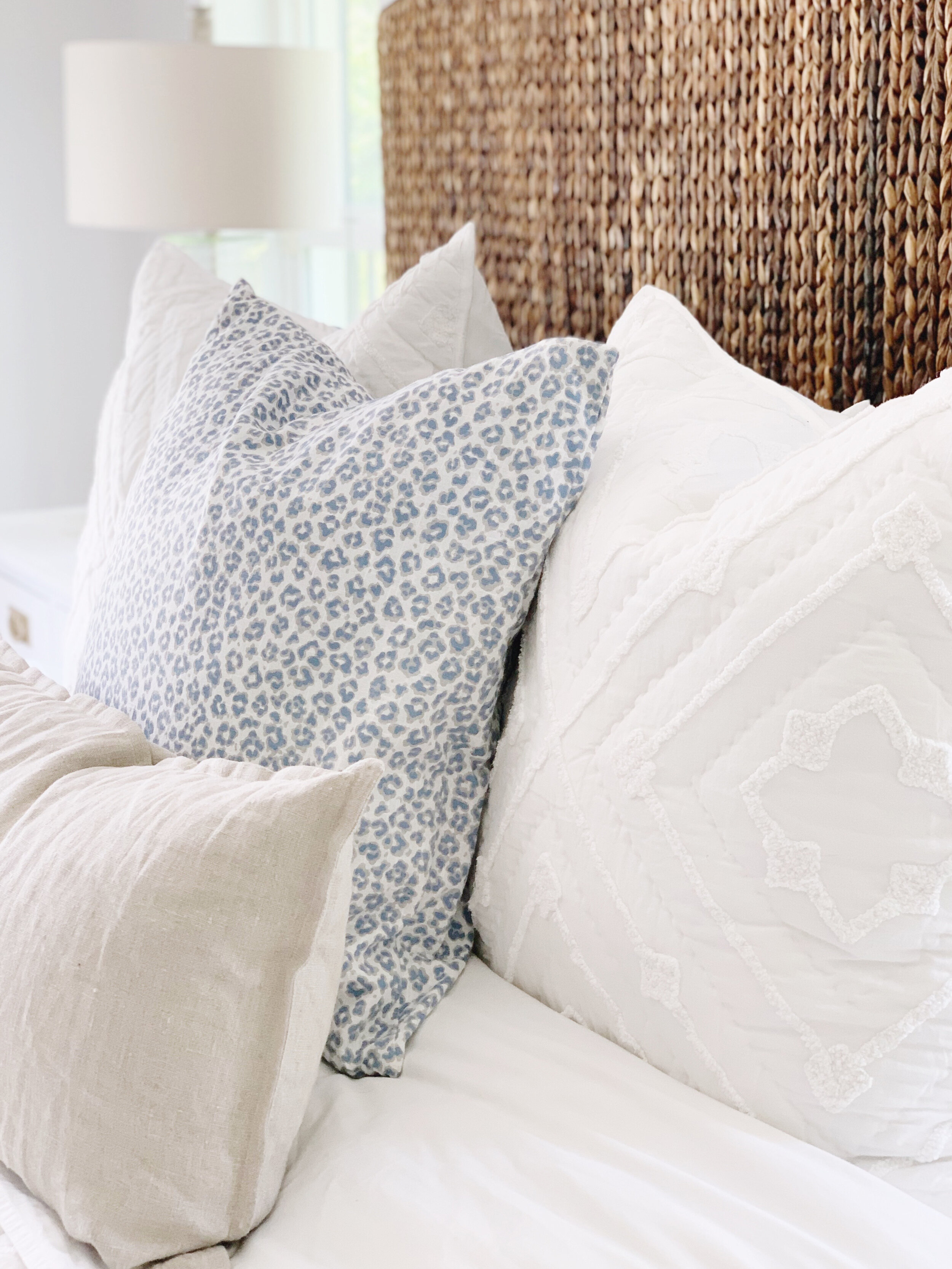
There was another change I wanted to make when redoing the bedding, the way I made the bed. I wanted a more modern look with just two Euro shams instead of three against the headboard. I wanted a touch of color on the bed too but it was so hard finding the exact blue blanket I wanted. I ended up going for a quilt and since it came with shams, I threw them on too. I like the hint of blue that peeks out behind the Euros.
<div class="shopthepost-widget" data-widget-id="4097738"><script type="text/javascript">!function(w,i,d,g,e,t){d.getElementById(i)||(element=d.createElement(t),element.id=i,element.src="https://widgets.rewardstyle.com"+e,d.body.appendChild(element)),w.hasOwnProperty(g)===!0&&"complete"===d.readyState&&w[g].init()}(window,"shopthepost-script",document,"__stp","/js/shopthepost.js","script")</script><div class="rs-adblock"><img src="https://assets.rewardstyle.com/production/2e66b92e3cb723e05750acd4484ef856c5c0c7f3/images/search/350.gif" onerror='this.parentNode.innerHTML="Disable your ad blocking software to view this content."' style="width: 15px; height: 15px"><noscript>JavaScript is currently disabled in this browser. Reactivate it to view this content.</noscript></div></div>
Holiday Decor: Partnership with Bealls Outlet
Needless to say, I was pretty excited when Bealls Outlet reached out and wanted to collaborate on a holiday decor project! Most everything you’re going to see was purchased at Bealls Outlet… it’s honestly the first place I go to look for holiday decor so this partnership was perfection.
It’s not a secret that I LOVE me some Bealls Outlet. I may be biased but the Sebastian store is by far the best one I’ve ever been in. It’s huge, organized and restocked frequently. It’s actually the 3rd location for this store since it came to town, and I’ve shopped at all of them since I was a kid! I would estimate that 85% of my home accessories and more are from this store. I love that everything is super cute but reasonably priced!
Needless to say, I was pretty excited when Bealls Outlet reached out and wanted to collaborate on a holiday decor project! Most everything you’re going to see was purchased at Bealls Outlet… it’s honestly the first place I go to look for holiday decor so this partnership was perfection.
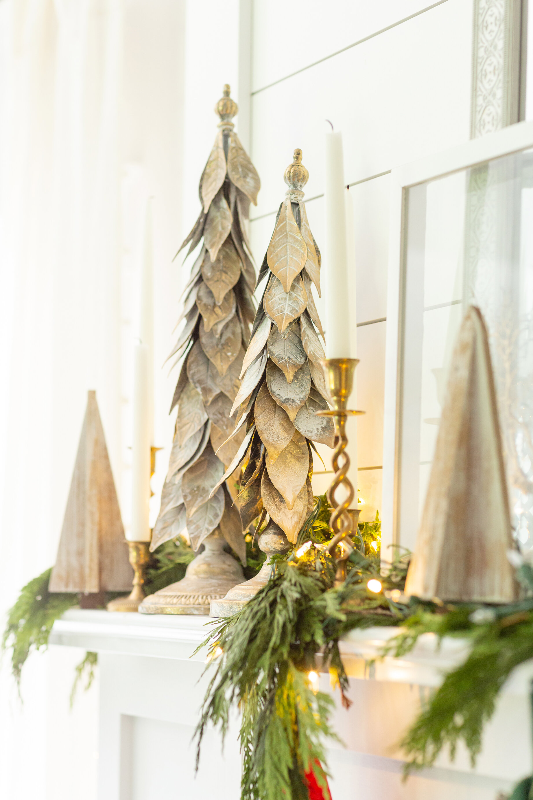
Onto the decor! I like to switch up my mantel every year. Something about it being a focal point wants me to use some creativity with the decorations. I found these beautiful gold metal Christmas trees at Bealls Outlet and knew they’d be perfect for the mantel. Nothing like a little real greenery to bring the Christmas spirit. I added my vintage brass candlesticks and this is what it looks like!
When it comes to Christmas decorations, some people love angels, or snowmen (I like those too) or Santa Clause, but I find myself being drawn to Christmas trees. I’ve collected them over the years and decided to add couple to the collection from Bealls Outlet this year. I put them different places every year, they’ve been on my kitchen island, the dining table, mantel and this year I decided to put them on the coffee table. I love that they look like a collection and not a “set,” know what I mean?
Next up, the kitchen. I picked up two garlands so with the 2nd one I split it up and used it a few places in the house, one of which being above the kitchen window. I found these wreaths on stands at Bealls Outlet and thought they’d be perfect for this window sill. They don’t block much light and are just wintery and perfect.
Our guest bathroom needed a little holiday flare so I used my fave Bealls Outlet holiday accessories on the vanity! I’m obsessed with that holiday potpourri and little gingerbread house too, isn’t it cute? The girls think the garland makes them feel like you’re in the forrest and said, “It’s so cool!”
Decorating for the holidays doesn’t have to be complicated and it doesn’t have to cost a lot of money either! I love the variety of pieces available at Bealls Outlet and the fact that it’s all so reasonable and cute! Where do you shop for holiday decor?
DIY Hanging Daybed
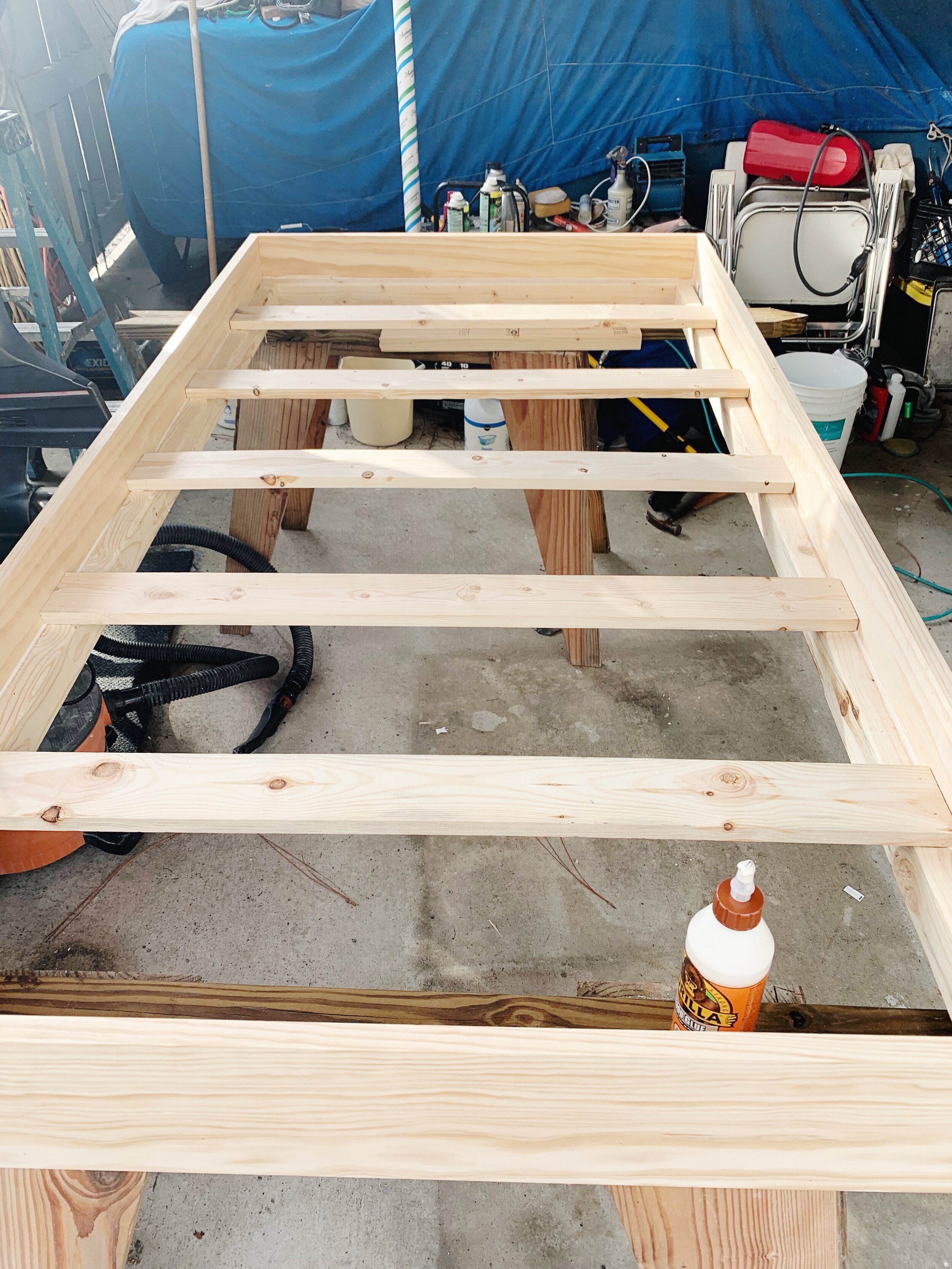
I went back and forth on what I wanted on our covered porch area once the pool was completed. I thought about a bar and barstools, I thought about just a dining table and finally decided on a place to relax in the shade. After some Pinteresting I found an easy-to-follow plan to build a hanging daybed.
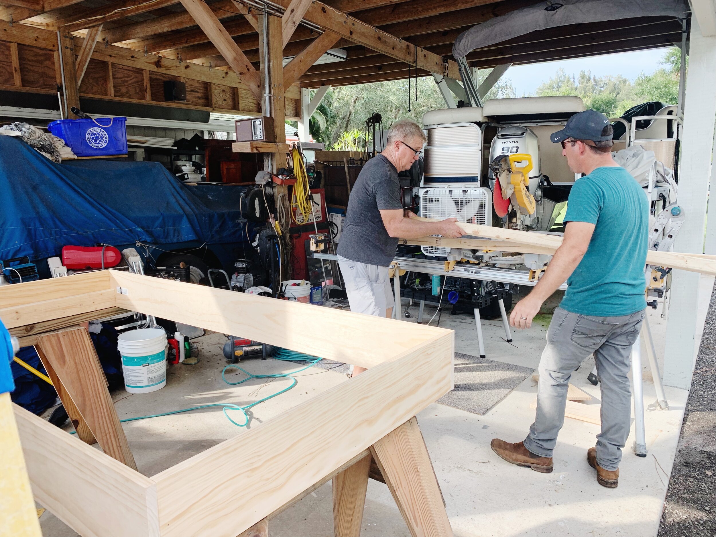
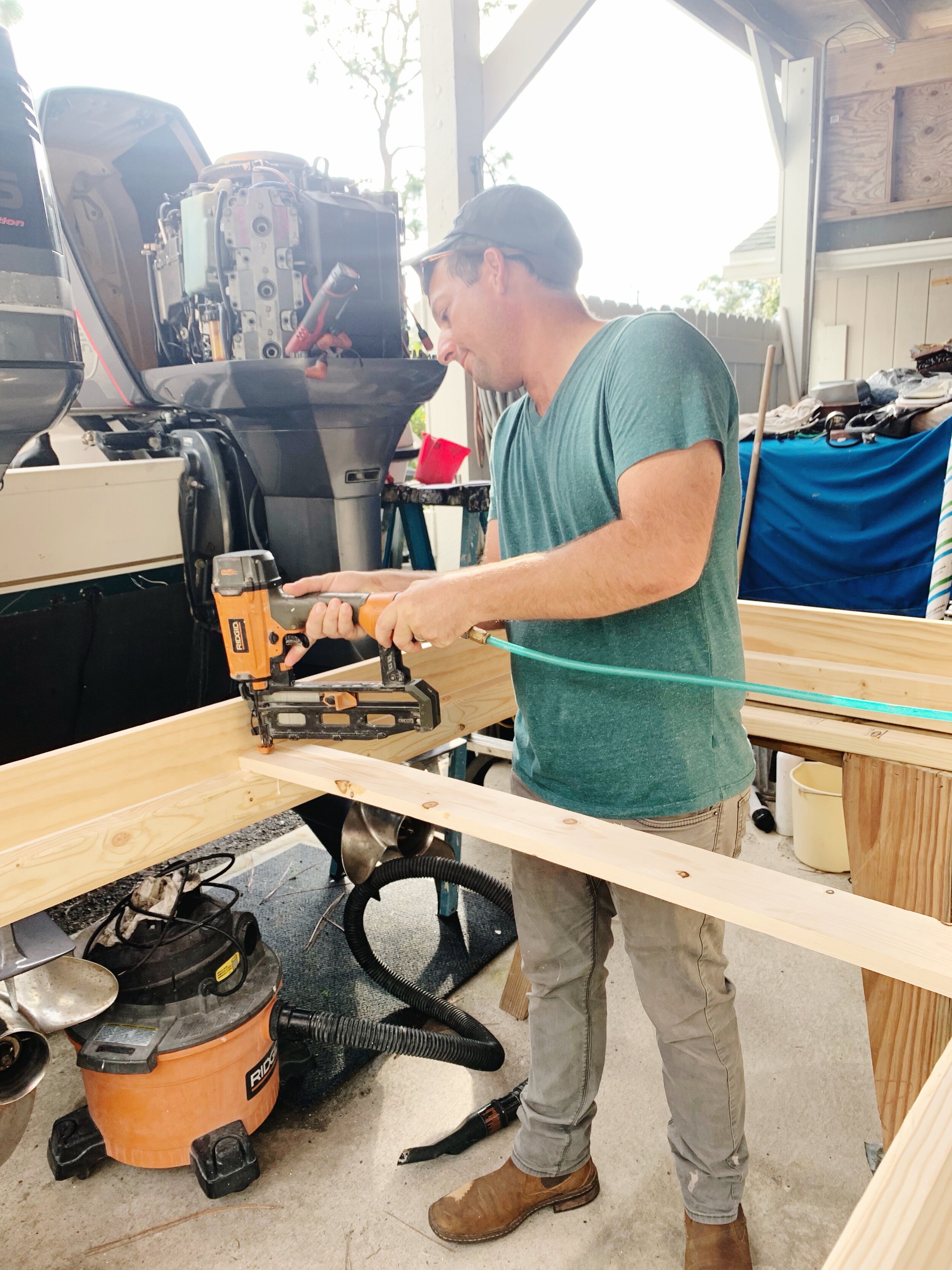
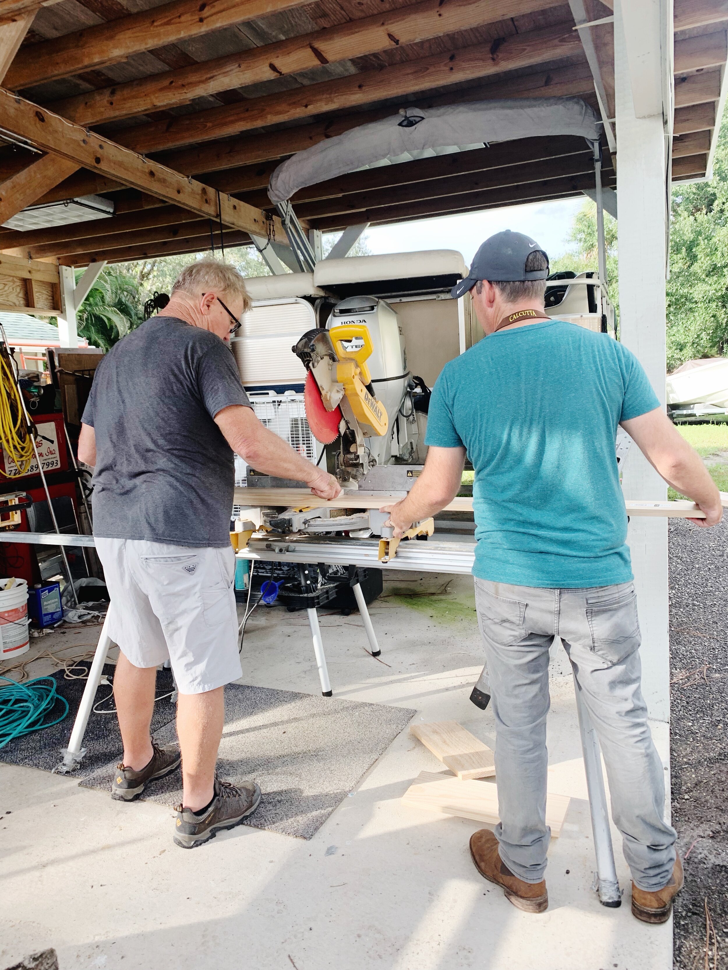
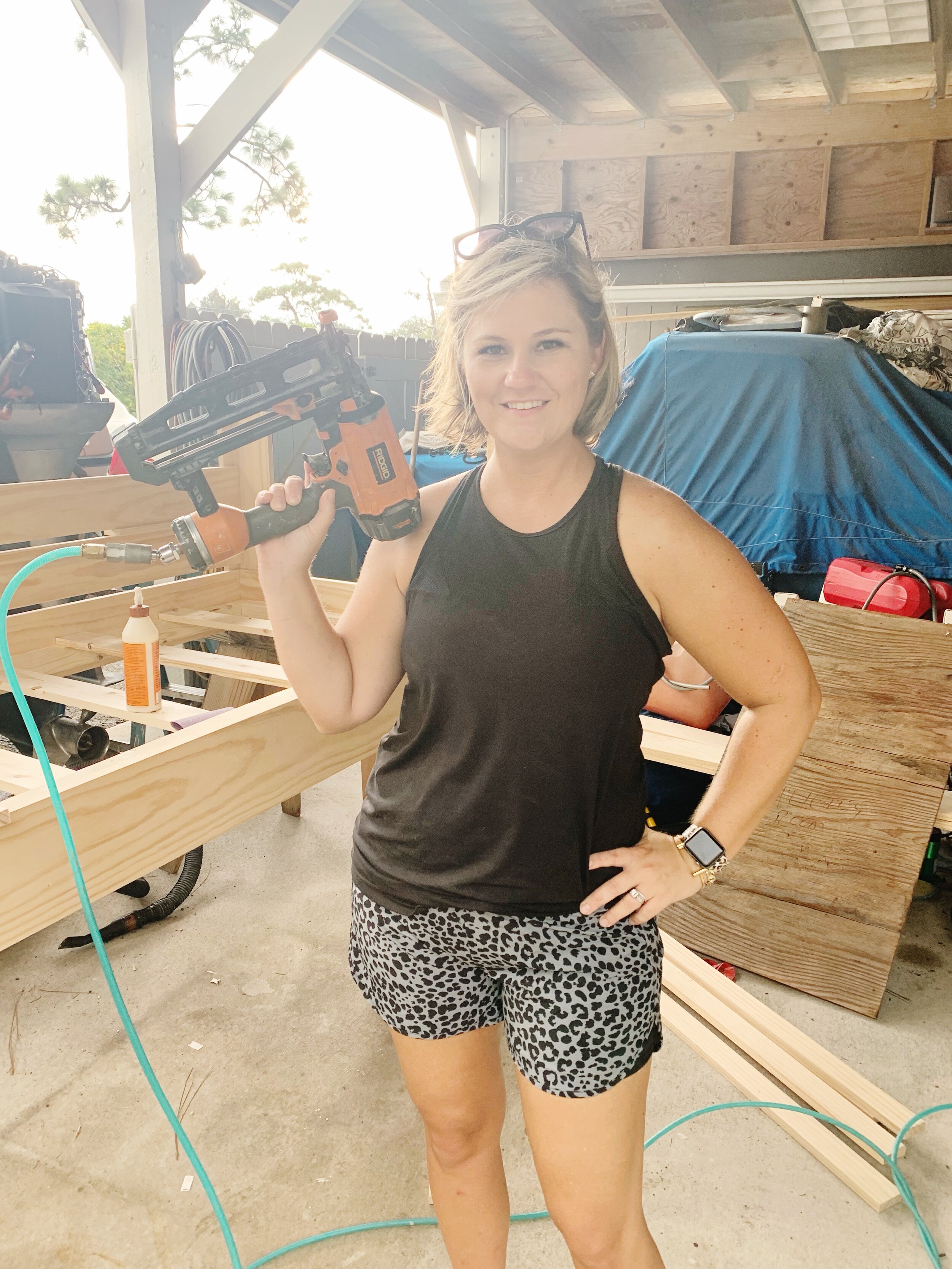
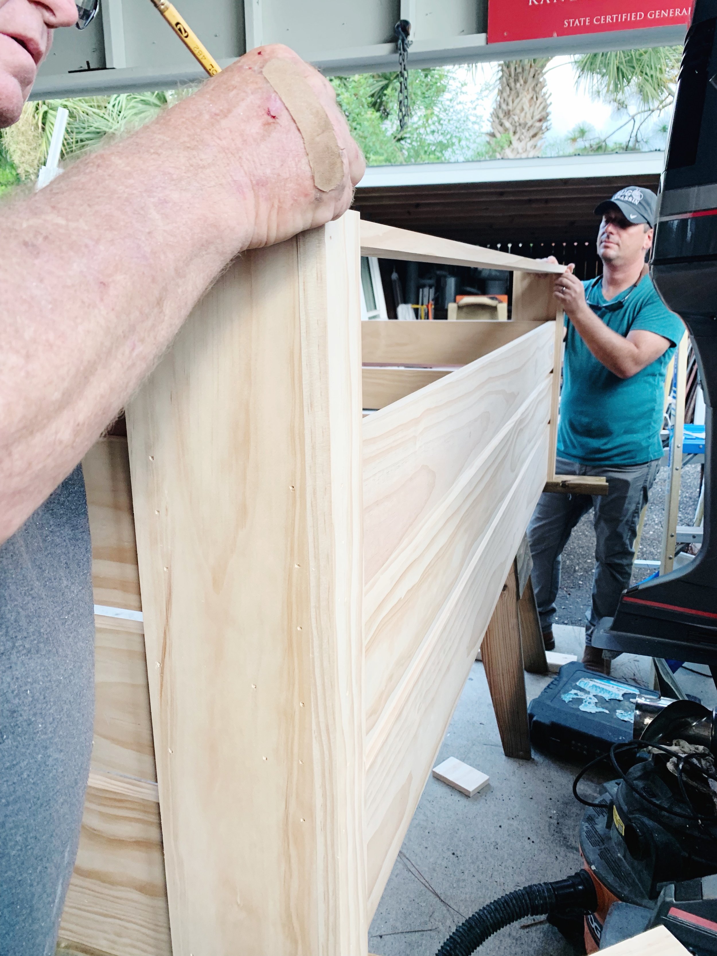
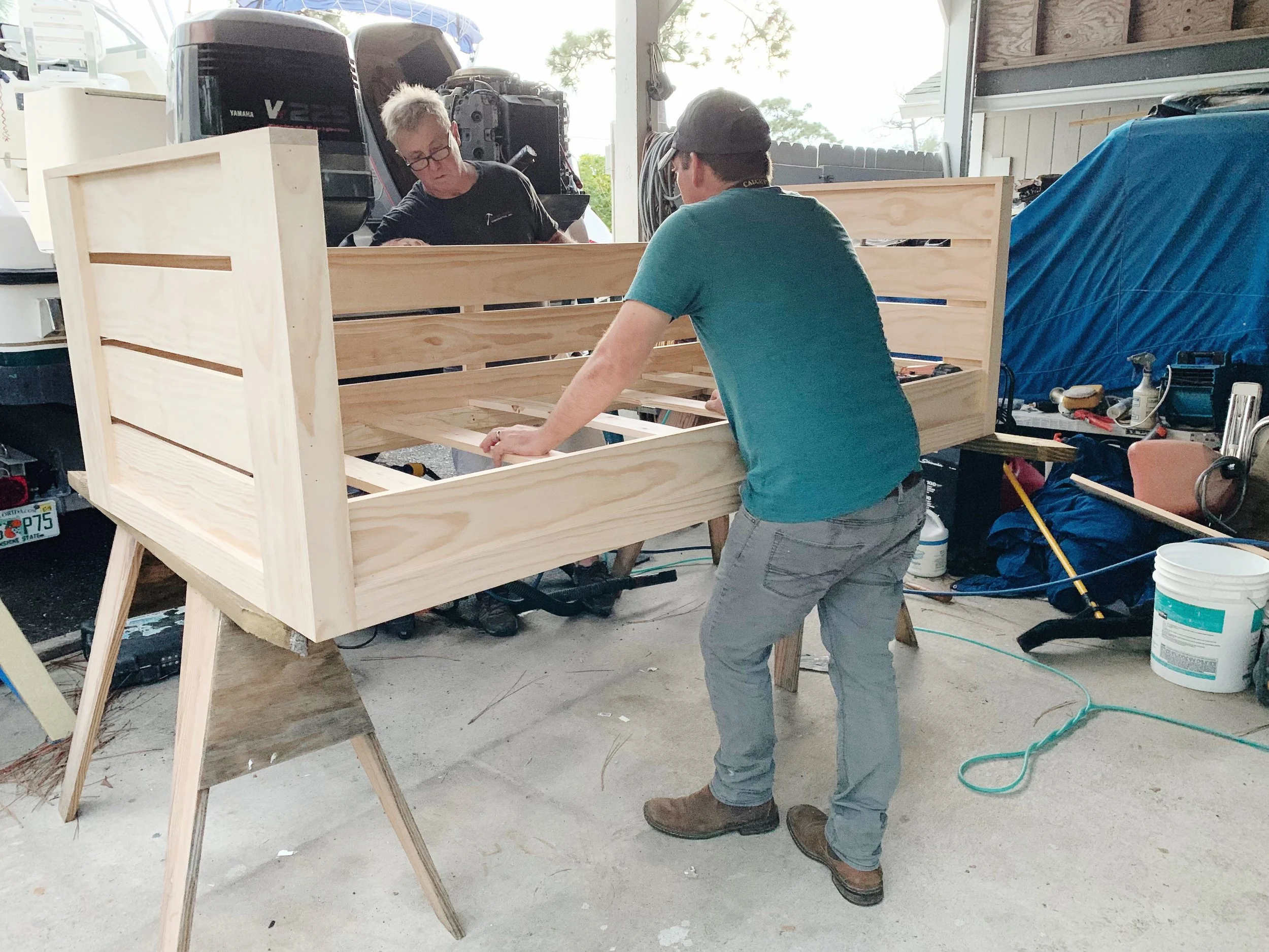
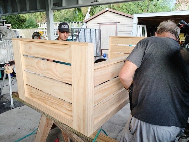
I went back and forth on what I wanted on our covered porch area once the pool was completed. I thought about a bar and barstools, I thought about just a dining table and finally decided on a place to relax in the shade. After some Pinteresting I found an easy-to-follow plan to build a hanging daybed. We were going to do it at home, but my Dad (a general contractor) suggested we bring the materials over to his house since he has all the tools. We’re so glad we did! We assembled most of it in one afternoon and then I added the finish the next day. Here are some behind-the-scenes pics of us working on it!
And here is the final product! I found a barely used mattress on Facebook Marketplace for $50, bought the cover from World Market and accessorized it with handmade pillows from Etsy. The girls love to read books laying on it and I like to take Sunday naps on it! It’s so cute, I’m obsessed.
Daybed Plans | Mattress Cover | Artwork by Jason Hines | Console | Lanterns (similar) | Grey Euro Pillows | Pillow Inserts | Palm Pillows | Grey Palm Pillow | B&W Striped Pillow | G&W Striped Pillows | Geometric Pillow | Wicker Furniture | Accent Tables | Bistro Table Set
New Pool and Outdoor Living Project
I am so excited! Our pool is finished! We have been dreaming of this since we moved into this house four years ago. We are on a large piece of property so the project felt a little overwhelming… it was basically like we had a blank slate! About six months ago Steve finally said, “Let’s just do it, the kids are at a great age to enjoy it, there’s no better time.” So we got a couple quotes and selected our contractor, Matt Miller from Indian River Pools.
I am so excited! Our pool is finished! We have been dreaming of this since we moved into this house four years ago. We are on a large piece of property so the project felt a little overwhelming… it was basically like we had a blank slate! About six months ago Steve finally said, “Let’s just do it, the kids are at a great age to enjoy it, there’s no better time.” So we got a couple quotes and selected our contractor, Matt Miller from Indian River Pools.
I knew I wanted a rectangular pool with a shallow sun shelf. I went back and forth on the exact size and the orientation in relationship to the house, but we ultimately decided to keep the pool in line with the house and designed it to be the length of our existing paver patio area. I also played with different ideas for the spa, but I really liked the idea of having it closer to the porch, that way people could be soaking in the hot tub, sitting on the porch or lounging on the long bench in the pool yet all be able to socialize together. I liked it being separate from the pool as well, I thought it felt more resort like. The water color was also important to me. Of course I was drawn to a water color we couldn’t get from the standard plaster finishes, so we decided to upgrade to a pebble finish by Wet Edge Technologies. The color is called Caribbean and it’s perfect.
As far as the furniture, I knew I wanted plenty of places to relax. I added a conversation area at the end of the pool. We find ourselves sitting there in the afternoon when the sun is behind the trees and the kids are still playing in the pool. I found the furniture at City Furniture. It was exactly what I was looking for and was so reasonably priced! I also loved that there were ALL the pieces I was looking for… sofas, chairs, chaises, and more. I wanted to keep our existing dining table and benches from World Market and mix in whitewashed wood as well, hence the finish I decided on for the daybed we built from plans courtesy of Plank & Pillow. Thanks Dad (aka Randy Hines Construction) for the assistance and use of your tools!
I decided to purchase all the outdoor pillow covers from Etsy… it was just easier to go custom than search around at Homegoods, Target or Pier 1 hoping to find something I was looking for. I love the black and white with a pop of palm! I did however pick up most of my outdoor accessories from my one and only, Bealls Outlet! The canvas of the wave is a photo taken at the Sebastian Inlet by my brother Jason Hines who is a surfer / photographer / videographer.
We are very happy with how the outdoor living and pool area has turned out. The kids have used it every single day since it’s been finished. Our only thought has been, “Why did we wait so long?!”
Wicker Furniture // Console // Bistro Set // Set of 3 Tables // Daybed Plans // Daybed Cover // Grey & White Stripe Pillows // Black & White Palm Pillows // Grey & White Palm Pillows // Black & White Stripe Pillows // Geometric Pillows // Green Palm Pillows // Herringbone Pillows // Other Outdoor Stuff
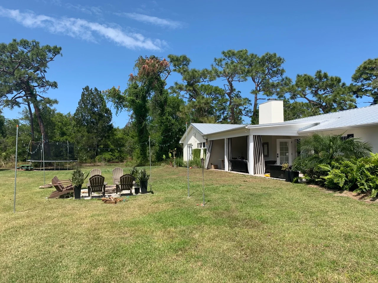
And in case you’re curious, here’s what the backyard looked like just a few months ago!
Neutral Dining Room
This summer I decided to take on a project… photographing the rooms in my house I haven’t shared yet! If you didn’t know, we renovated this house a few years back. It was a pretty big undertaking but I love our location - right around the corner from where I grew up and where my parents still live, our property - wood acreage that is rare to find in town, and our house - designed by myself and renovated by my Dad’s company.
This summer I decided to take on a project… photographing the rooms in my house I haven’t shared yet! If you didn’t know, we renovated this house a few years back. It was a pretty big undertaking but I love our location - right around the corner from where I grew up and where my parents still live, our property - wood acreage that is rare to find in town, and our house - designed by myself and renovated by my Dad’s company.
Our living, kitchen and dining room are all open to each other. We use our dining room every night (that we eat at home) and I love that. It’s not a formal space that collects dust. It’s the family table where we not only share meals, it’s where homework is done, where puzzles are put together, where games are played and where laughter is shared.
I wanted to keep the space beachy but neutral with a touch of farmhouse. The chairs and chandelier are from Ballard Designs and the table is from a local furniture company.
And if you’re curious about what the space looked like before… check out these pics! Quite the difference right? It’s hard to believe this is the same space!
Guest Bathroom Refresh: Palm Leaf Wallpaper Bathroom
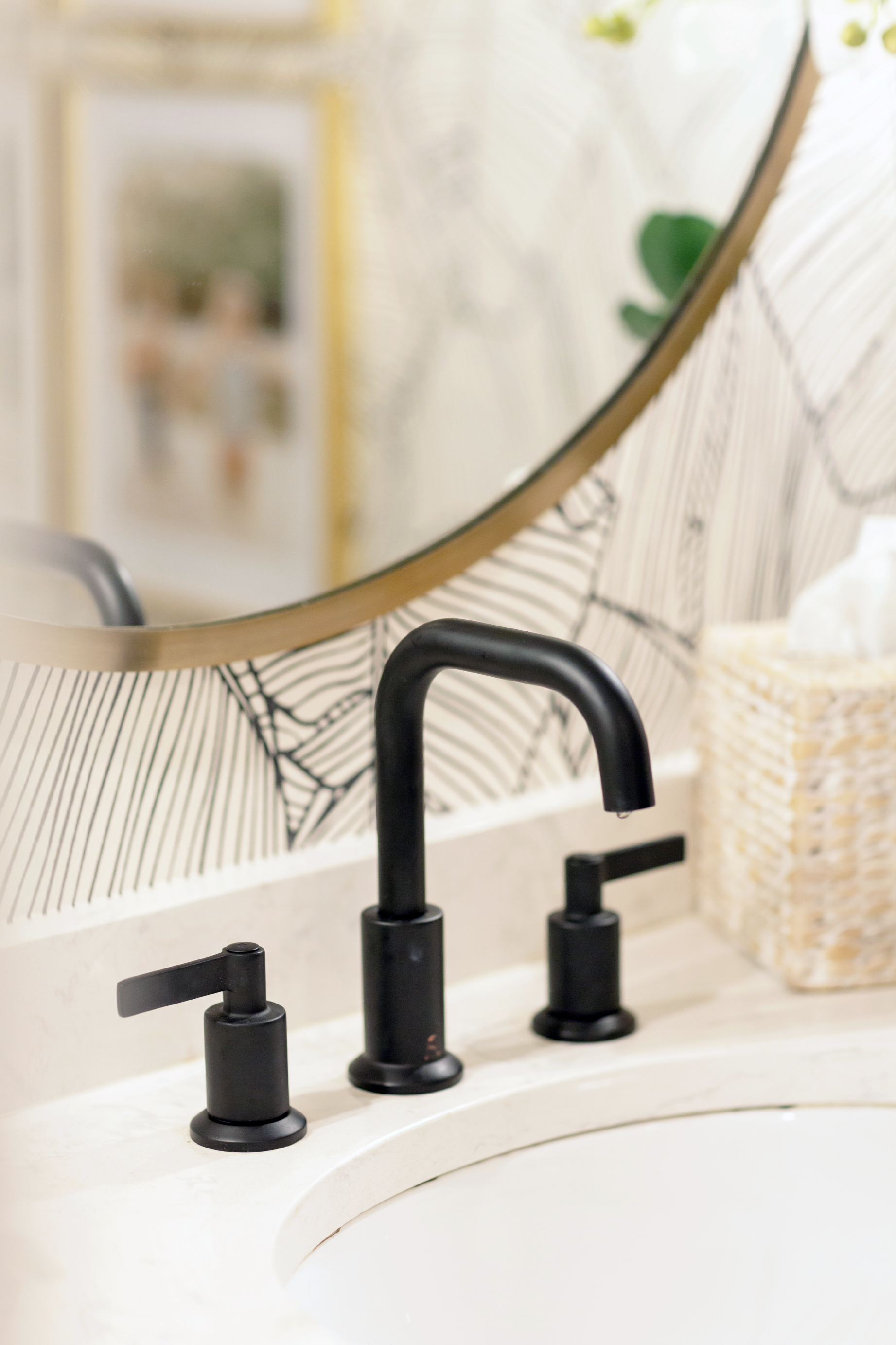
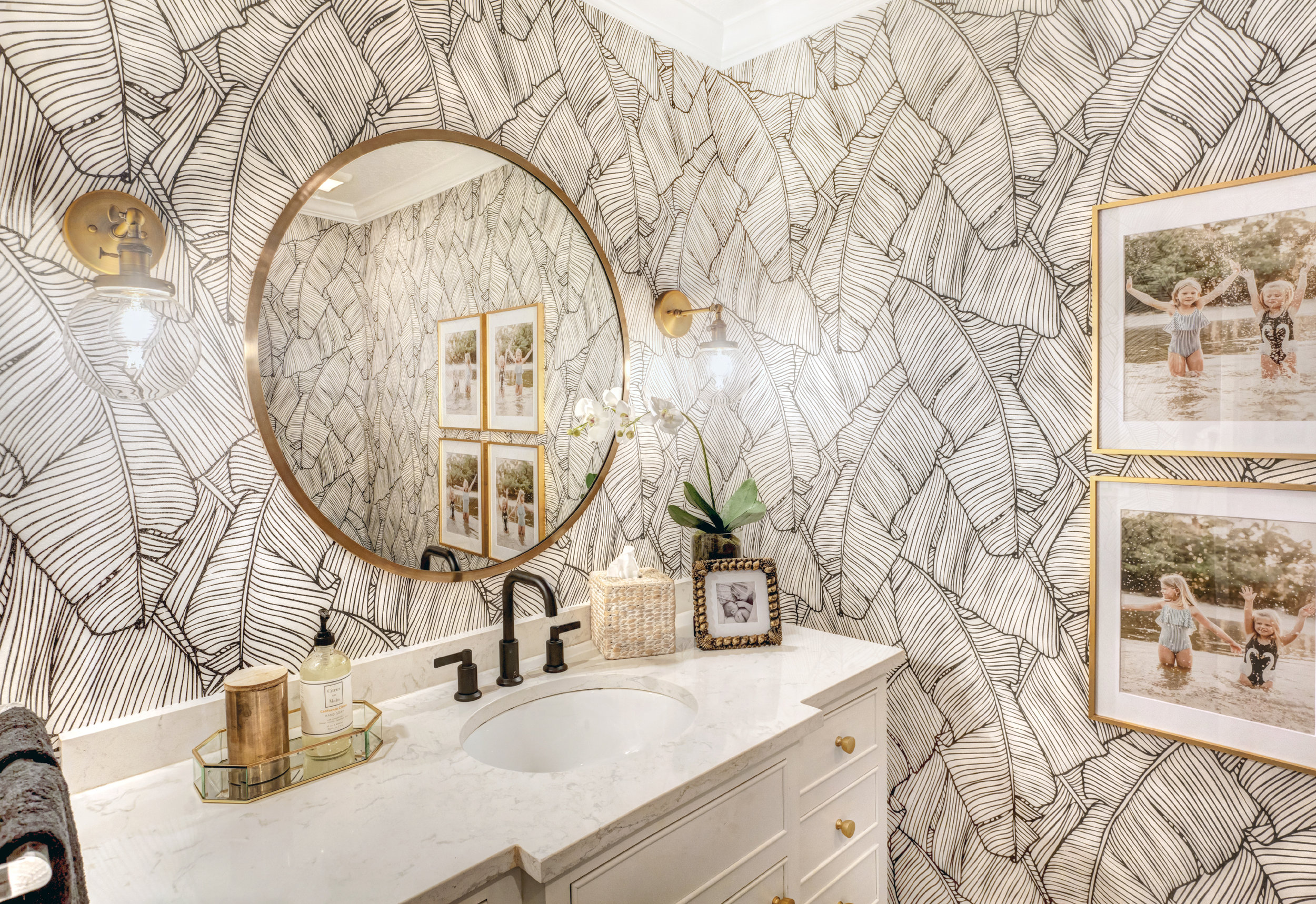
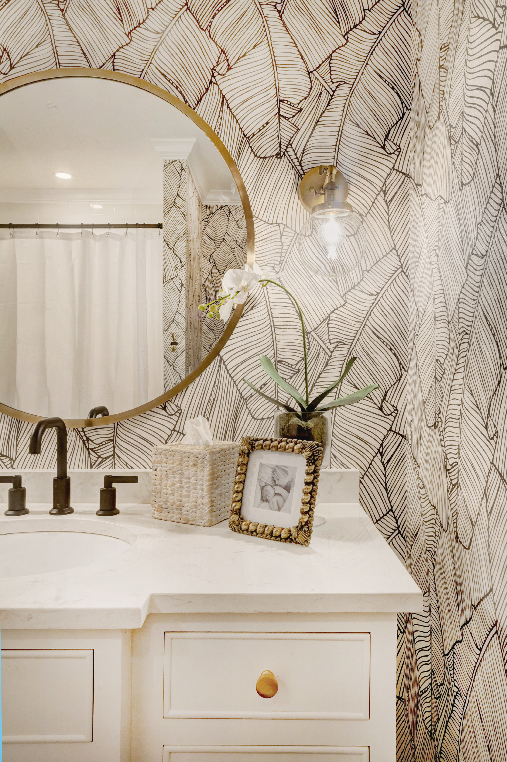
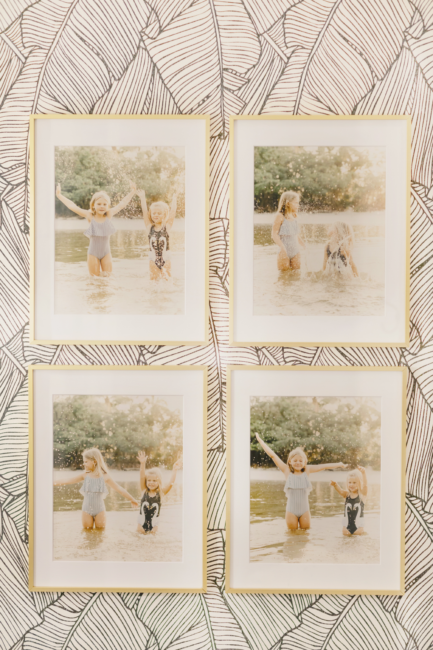
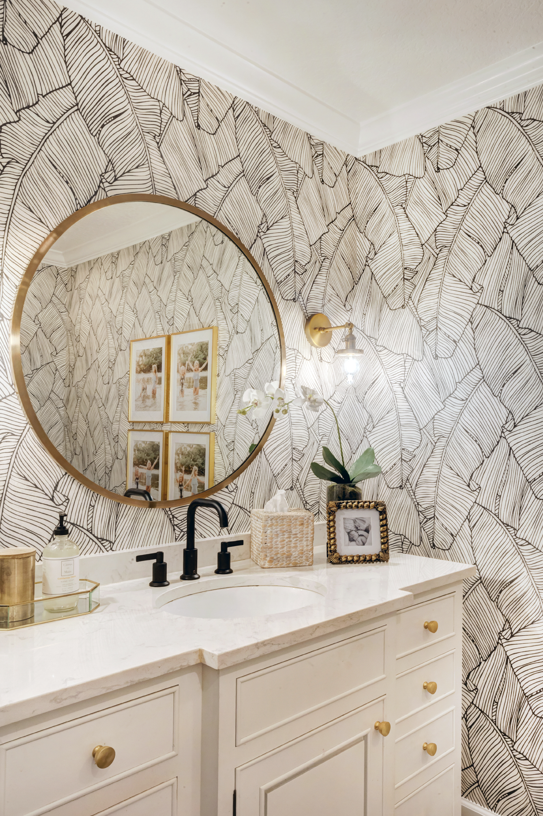
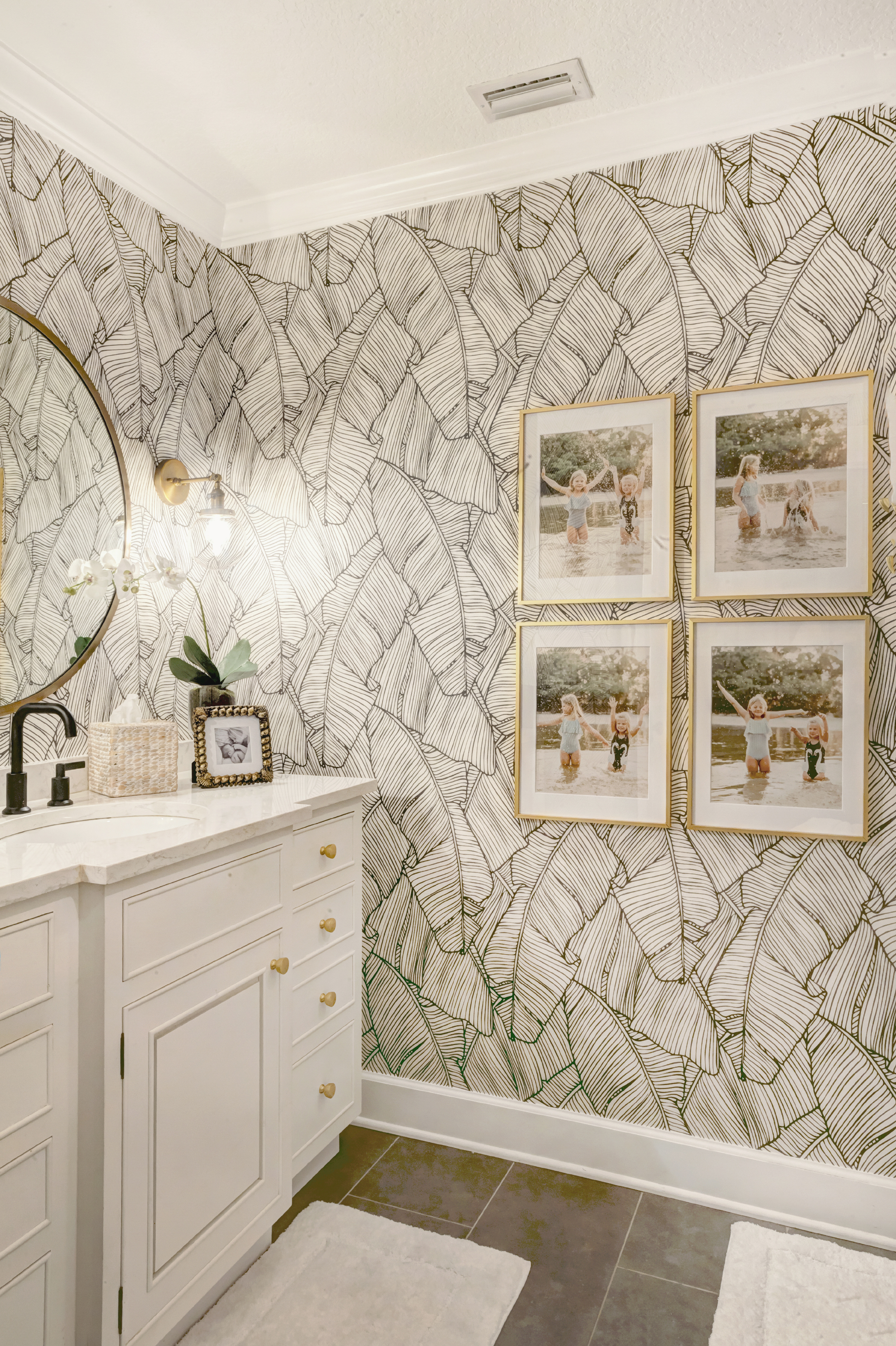
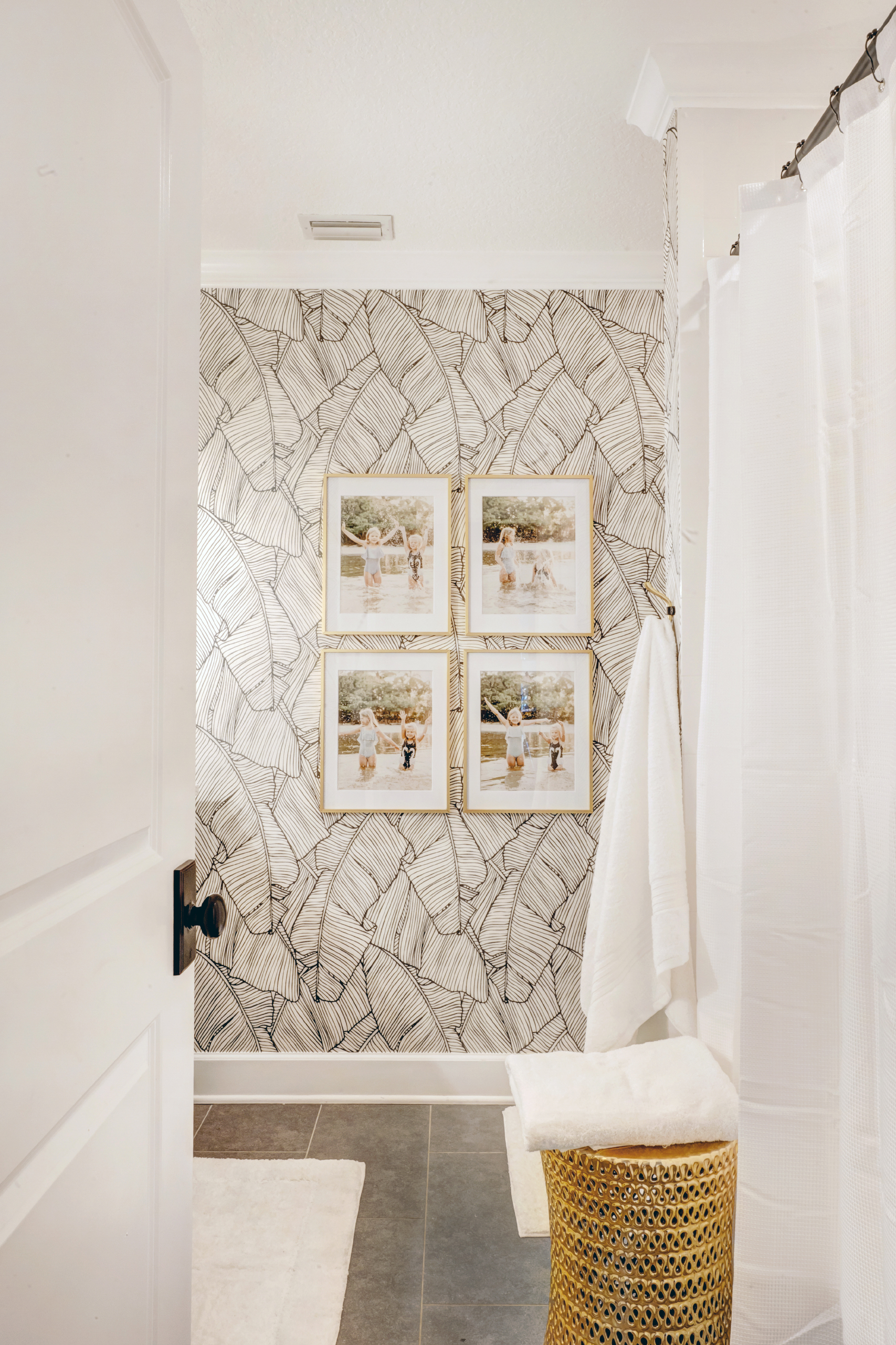
I’m so excited about this project! Like legit in love. I go in this palm leaf wallpaper bathroom, turn on the lights and smile from ear to ear. Awhile back I partnered with Walls Republic on my office project and I instantly knew I wanted to wallpaper this bathroom one day.
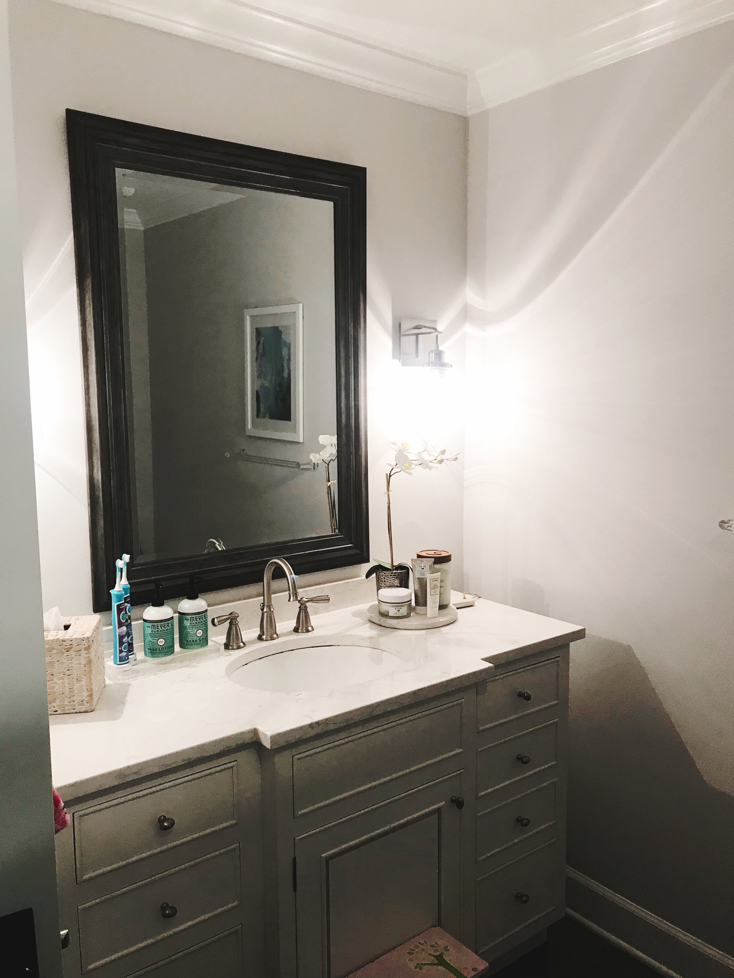
I’m so excited about this project! Like legit in love. I go in this palm leaf wallpaper bathroom, turn on the lights and smile from ear to ear. Awhile back I partnered with Walls Republic on my office project and I instantly knew I wanted to wallpaper this bathroom one day. I never really did anything in this room, it was painted the same light grey as the rest of the house but somehow the walls always looked dirty! It doesn’t help that they put their hands on the walls when getting on and off the potty, oy!
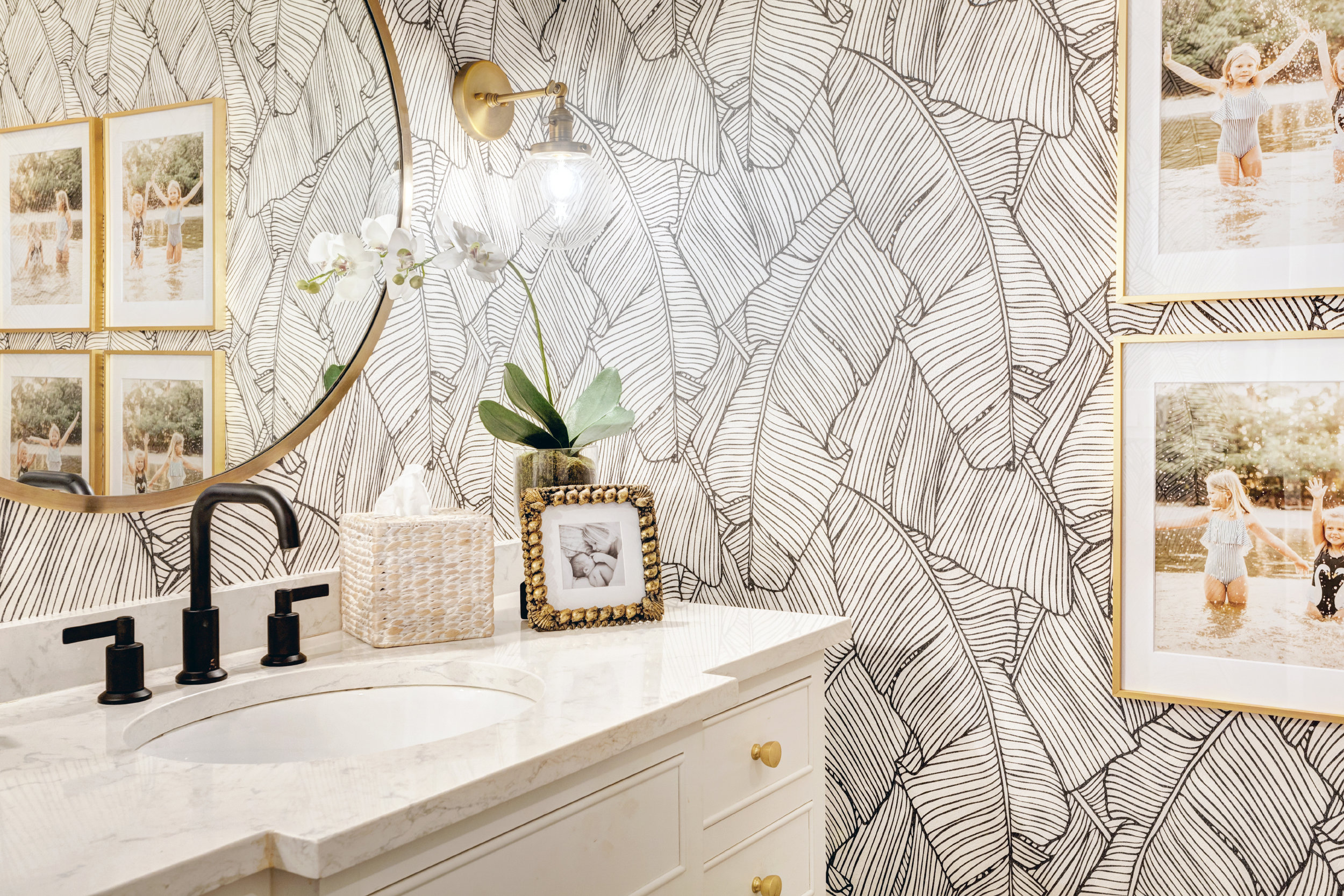
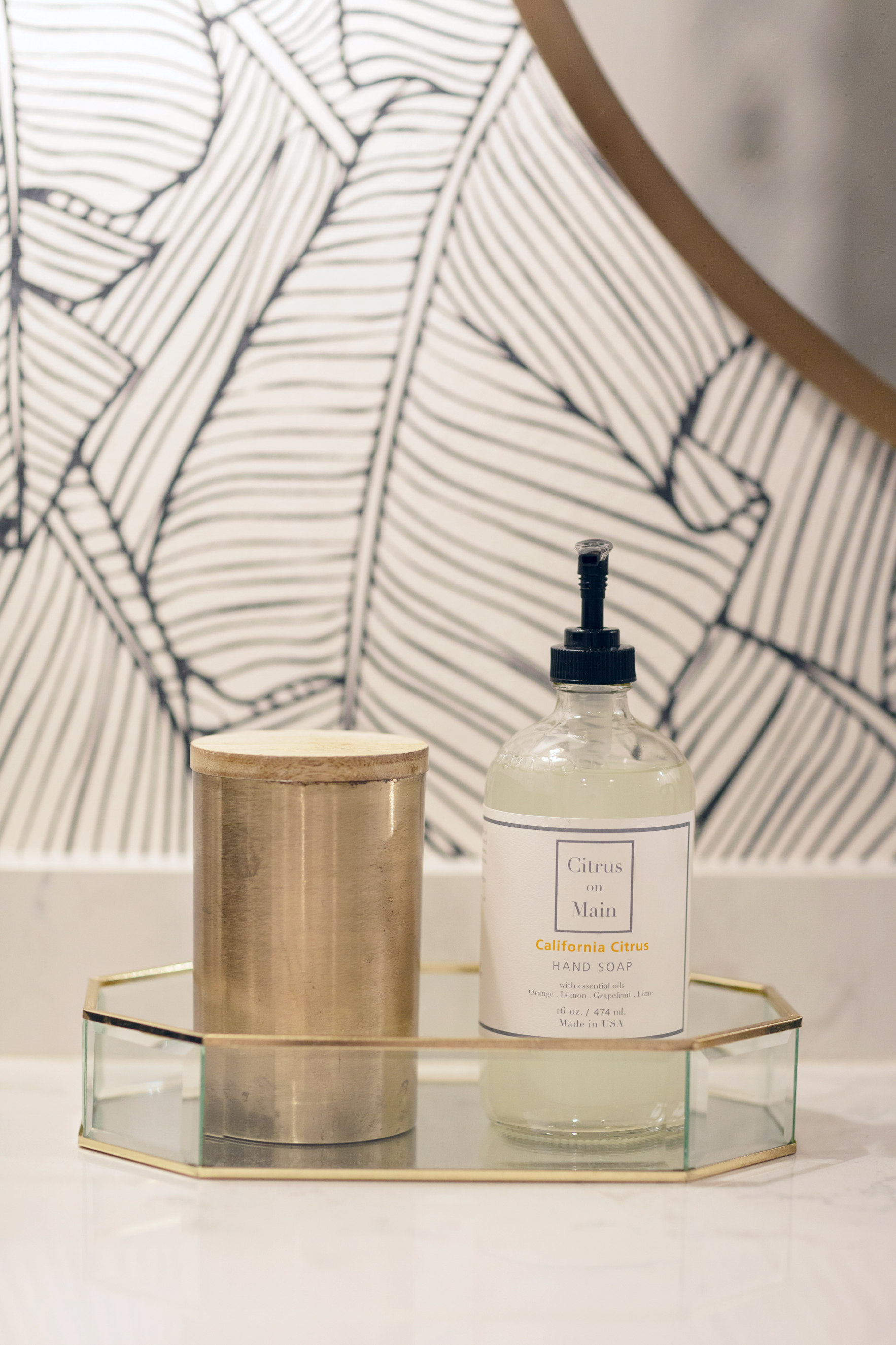
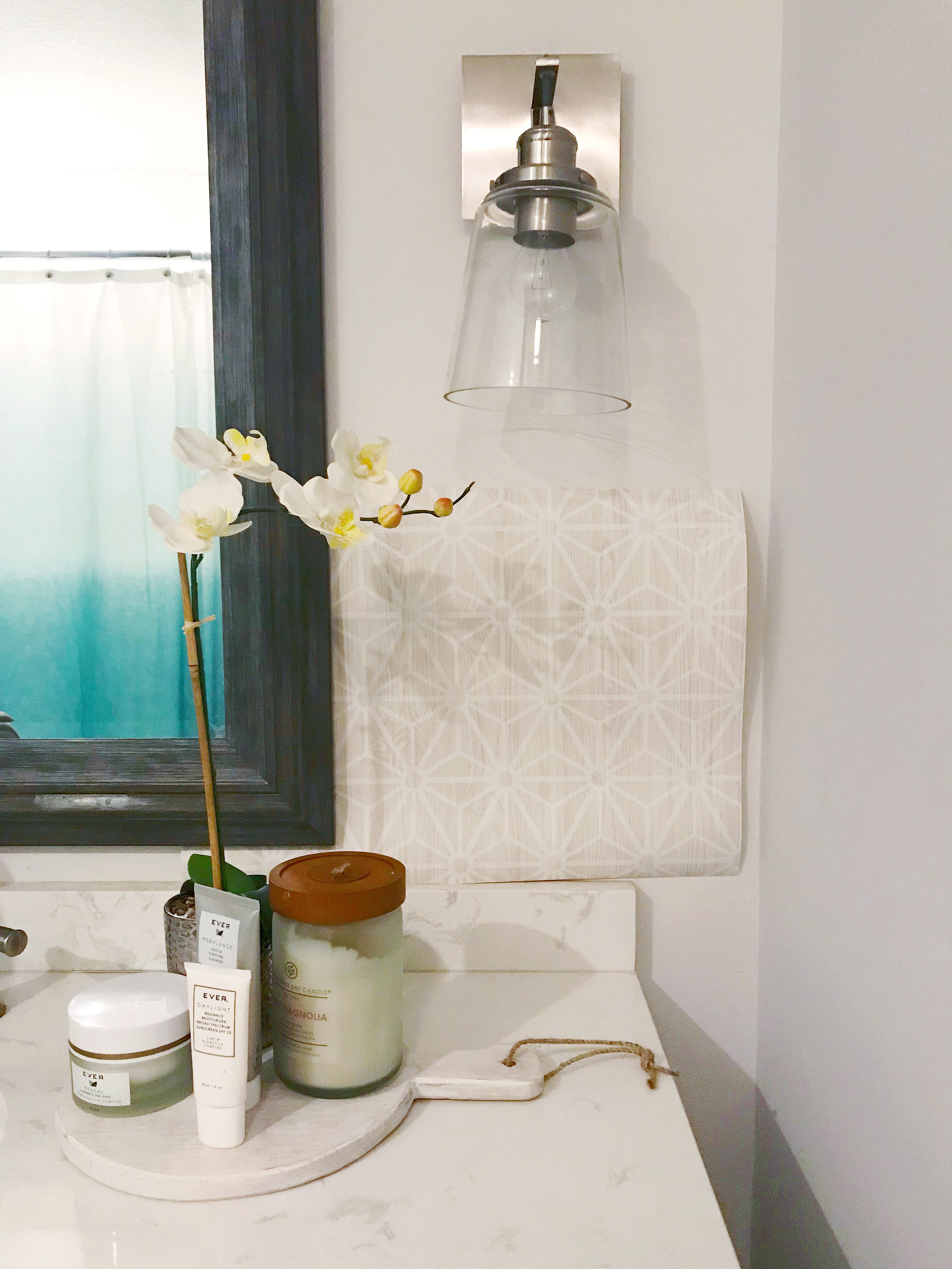
Like any project, when you start with one thing, it always leads to more and more and more! I really wanted to accent with gold but my faucet and hardware were brushed nickel. I decided it had to go! I changed out the faucet to a matte black, found a cute circular mirror and these sconces, these SCONCES! How cool are they?! And they were less than $50.00 each, what.a.find!
Walls Republic was so awesome to work with! They sent me several samples you may have seen me post about a few weeks ago. I admit, when I taped this one up on the wall my eyes literally looked like the heart eye emoji. I knew it was THE ONE! My wallpaper guy, Jim Finley, said the paper was GREAT quality and really easy to install. He actually said it was the coolest project he’s done in awhile! What do you guys think about how it turned out?
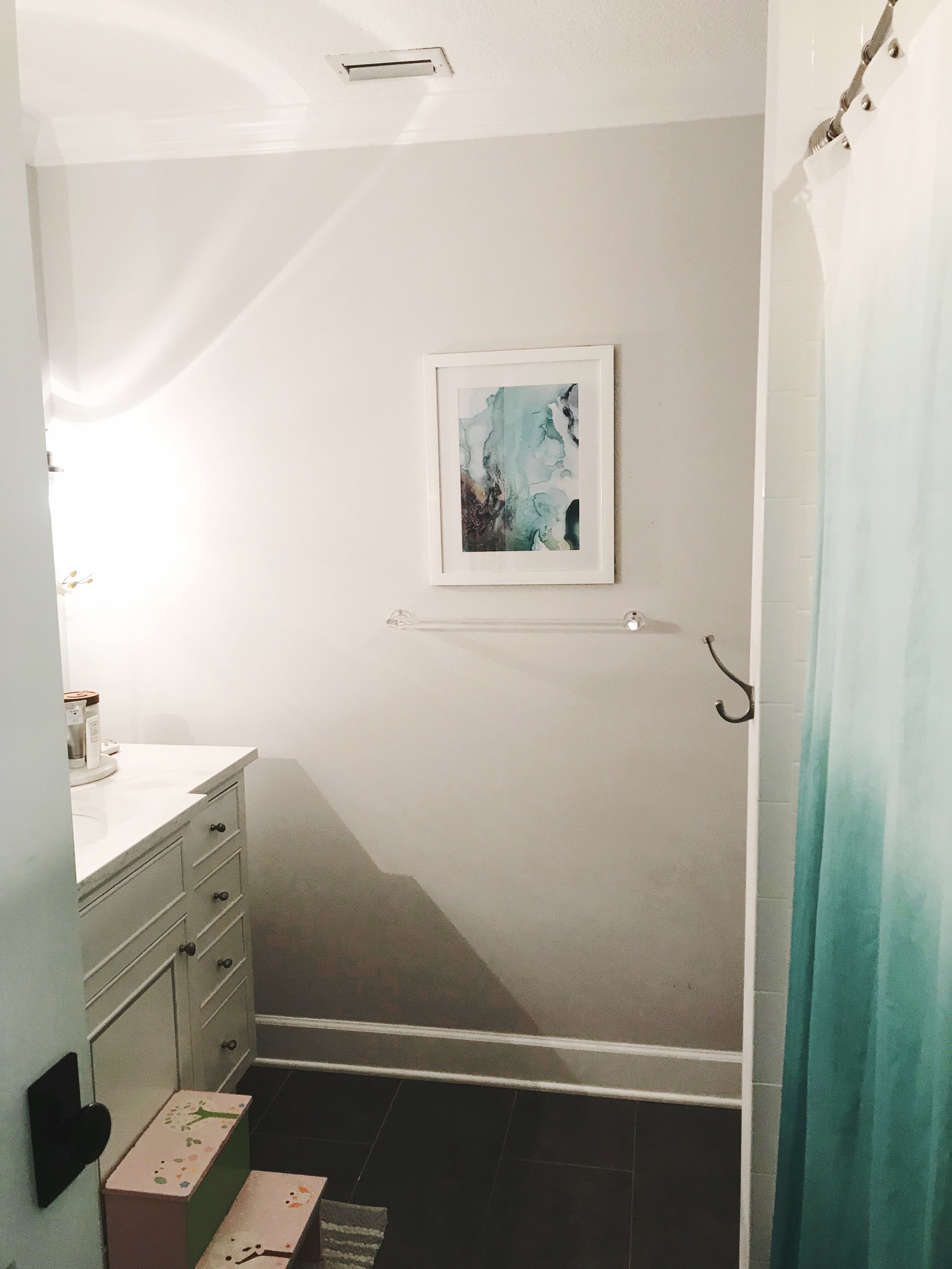
Here’s a little “Before/After” of the space! I’m so obsessed! Scroll down below for all the sources!
Wallpaper | Faucet | Mirror | Sconces | Gold Frames | Knobs | Bath Accessories
Thanksgiving Table Decor
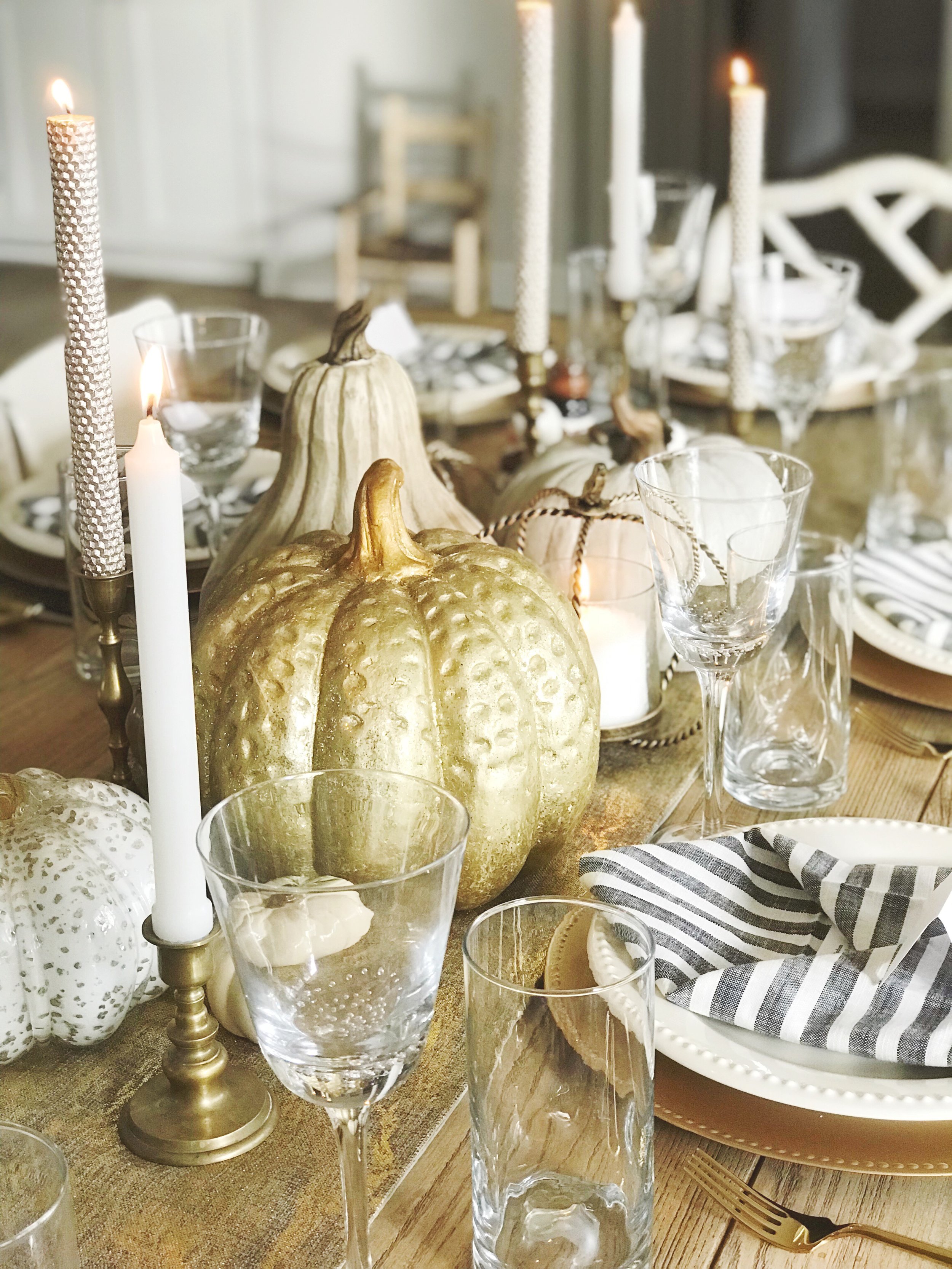
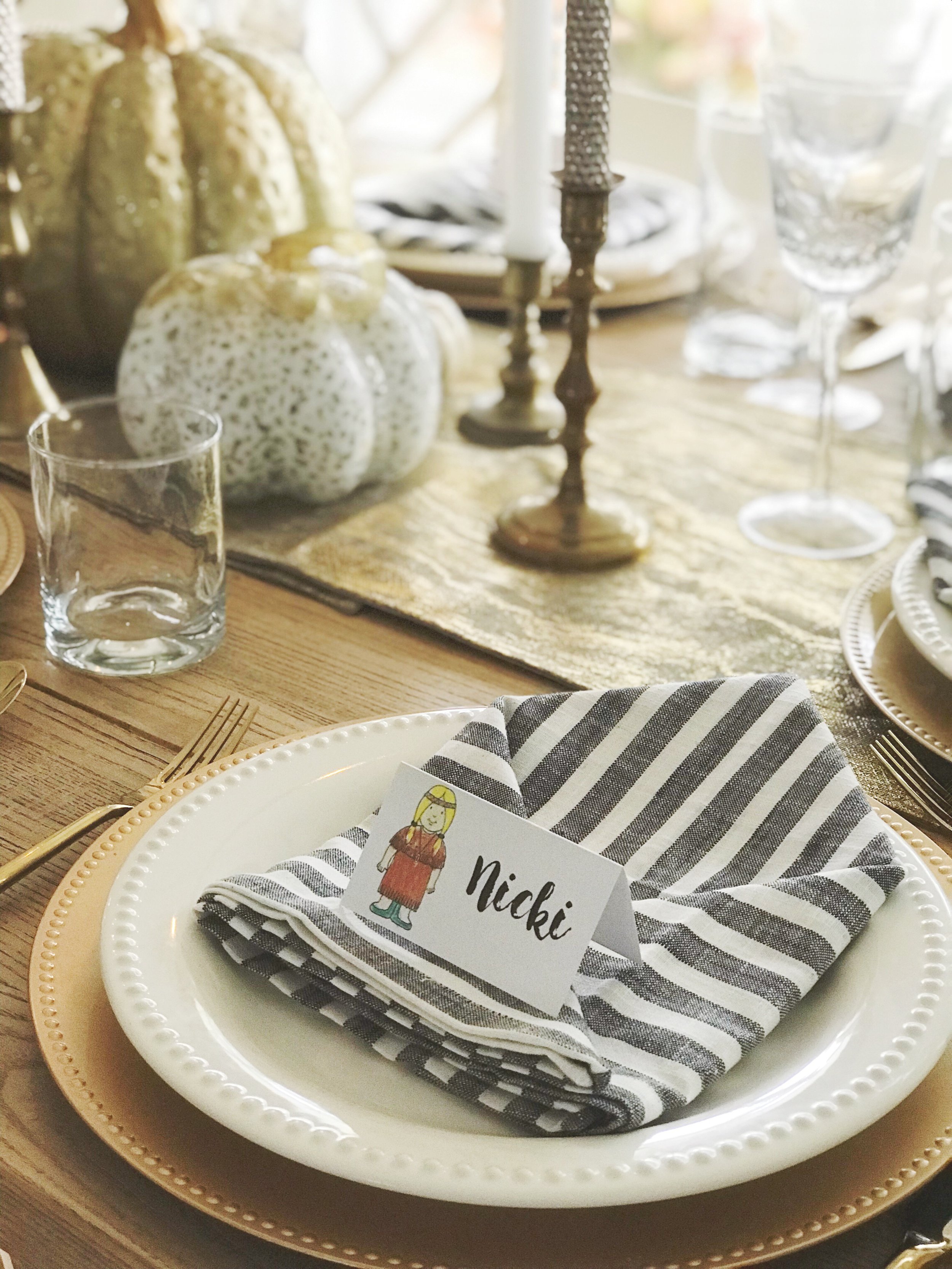
We had a beautiful Thanksgiving that was simple and full of family time! We played badminton while the turkey was in the infrared frier outside. We snacked on a charcuterie board while the sweet potatoes and stuffing were in the oven. We each read little cards with “Words of Wisdom” and “Thanksgiving Humor” jokes when we sat down to the table.
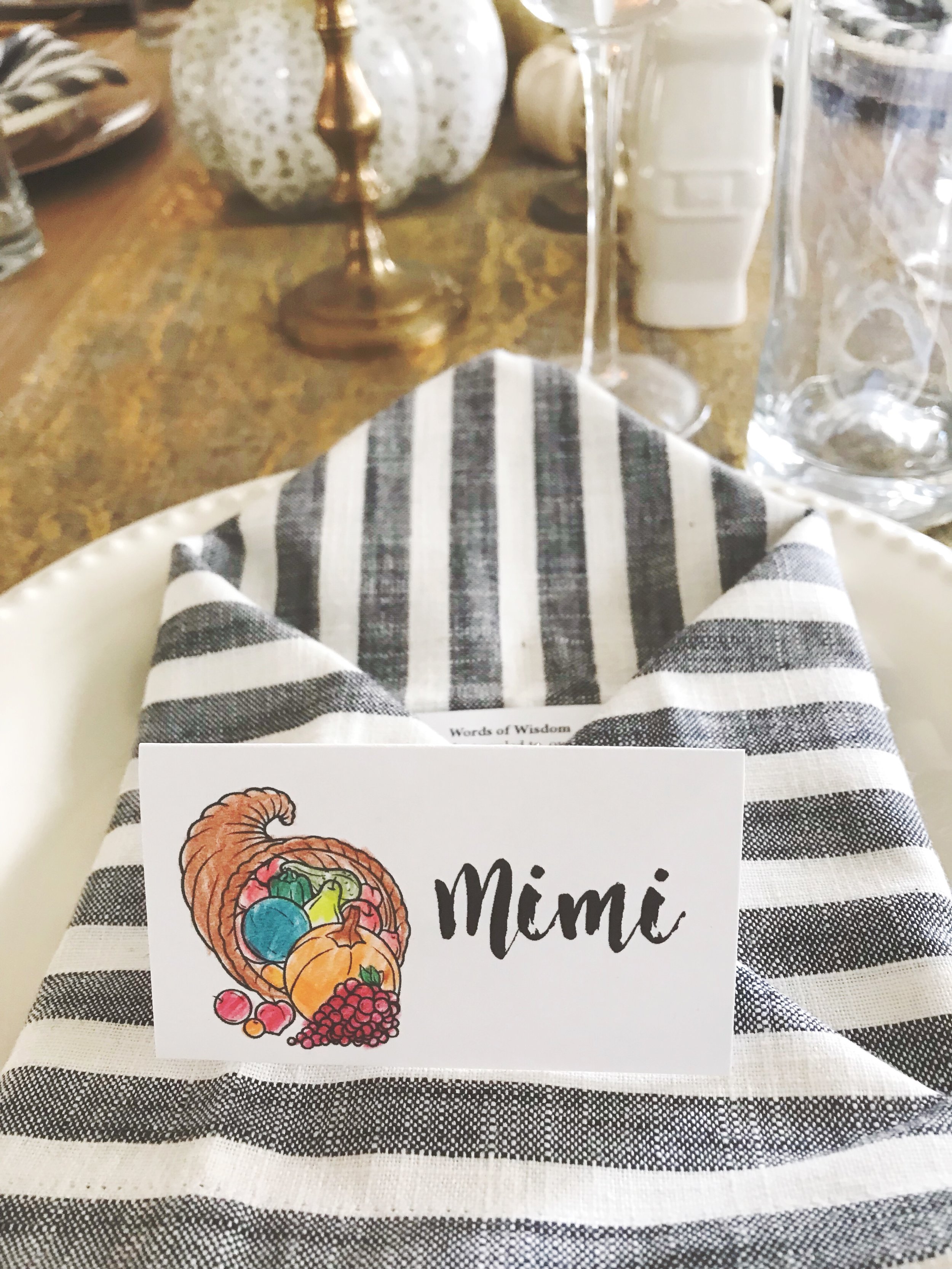
We had a beautiful Thanksgiving that was simple and full of family time! We played badminton while the turkey was in the infrared frier outside. We snacked on a charcuterie board while the sweet potatoes and stuffing were in the oven. We each read little cards with “Words of Wisdom” and “Thanksgiving Humor” jokes when we sat down to the table. The girls wanted to help so I printed out place cards for them to color and they did so, very beautifully. We decided to host at our house since my Mom is still recovering from her hip replacement surgery but I was happy to be able to set our table with the decor I had around the house. Overall it was very was low stress and pretty perfect and I hope yours was the same!
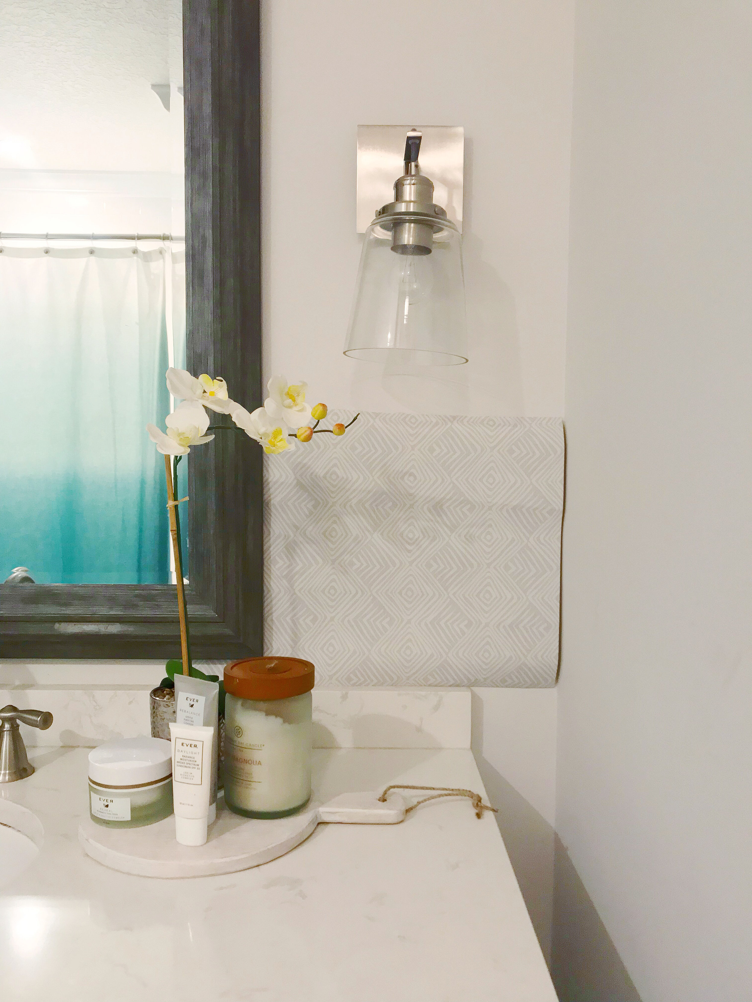
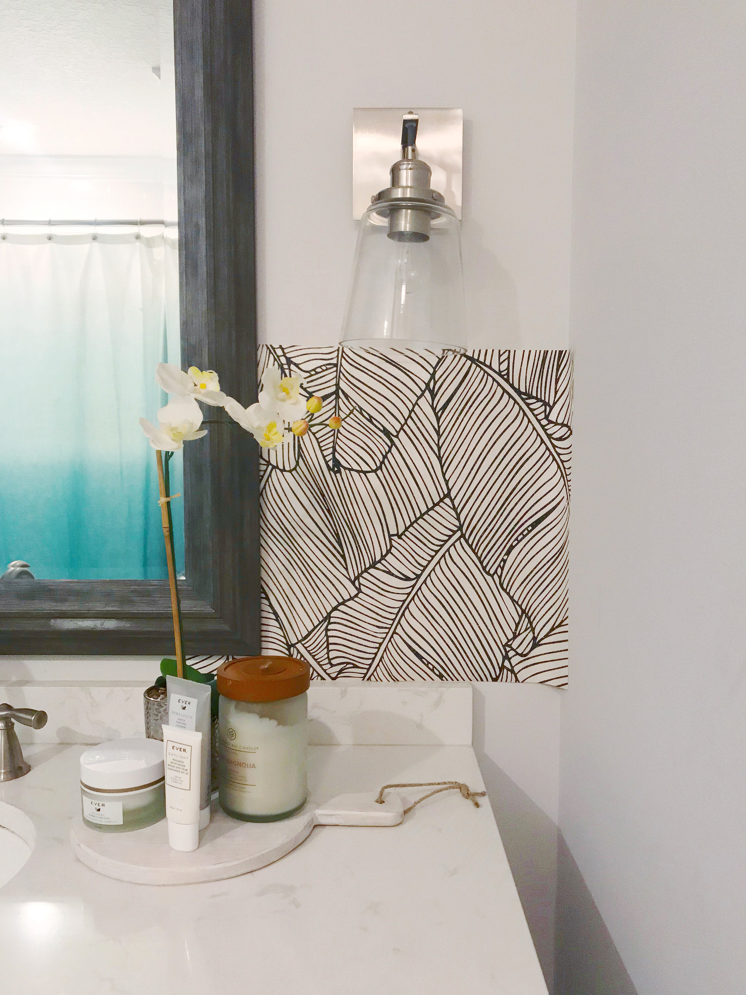
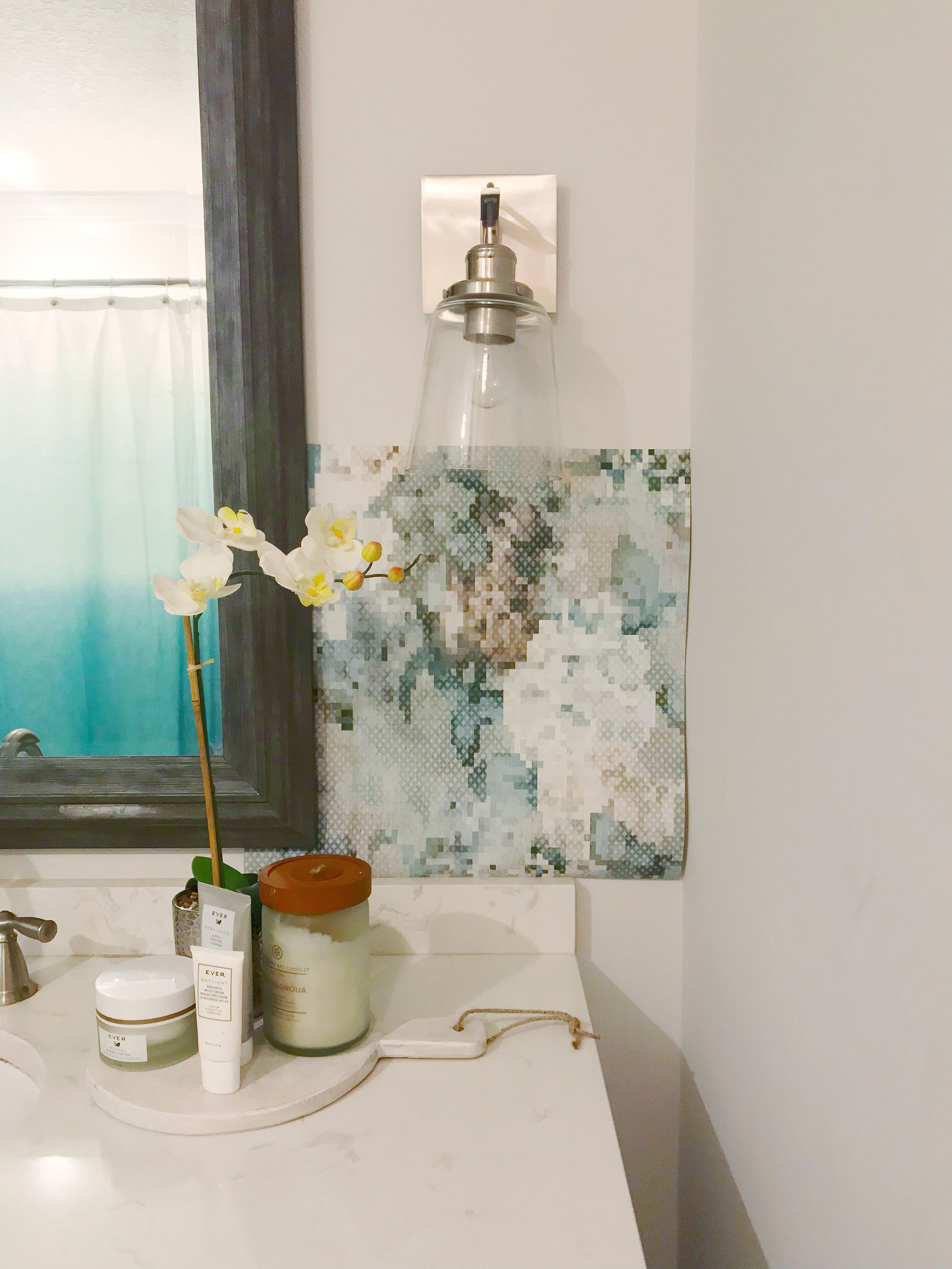
Guest Bathroom Refresh: Wallpaper Options
I decided it’s time for a Guest Bathroom Refresh! I happened to use the girls’ bathroom the other day and realized how much they touch the walls to get on and off the potty. I have magic eraser-ed them before, but they just look dingy!
I decided it’s time for a Guest Bathroom Refresh! I happened to use the girls’ bathroom the other day and realized how much they touch the walls to get on and off the potty. I have magic eraser-ed them before, but they just look dingy! I was thinking it would be nice to be able to wipe down the walls. I was also thinking how CUTE wallpaper would look in this space. I then concluded, it’s time for another project!
The one thing that isn’t ideal about the guest bathroom is that it’s an interior room, so there are no windows. I thought about adding a light tube or skylight when we renovated the house but my Dad the general contractor said they are always a pain because of leaks. This is also the bathroom that guests use so I think using wallpaper in the bathroom would make it feel more special!
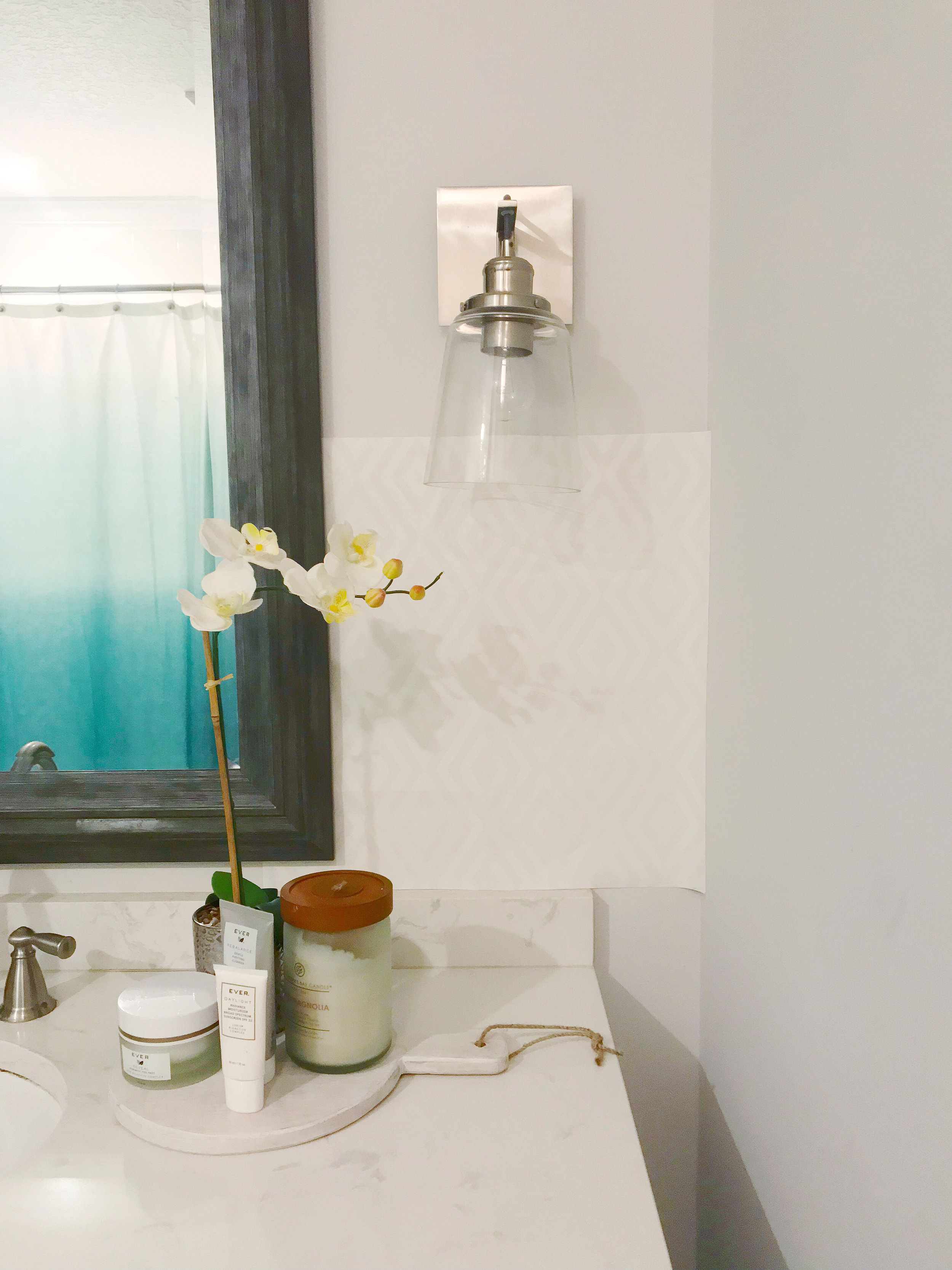
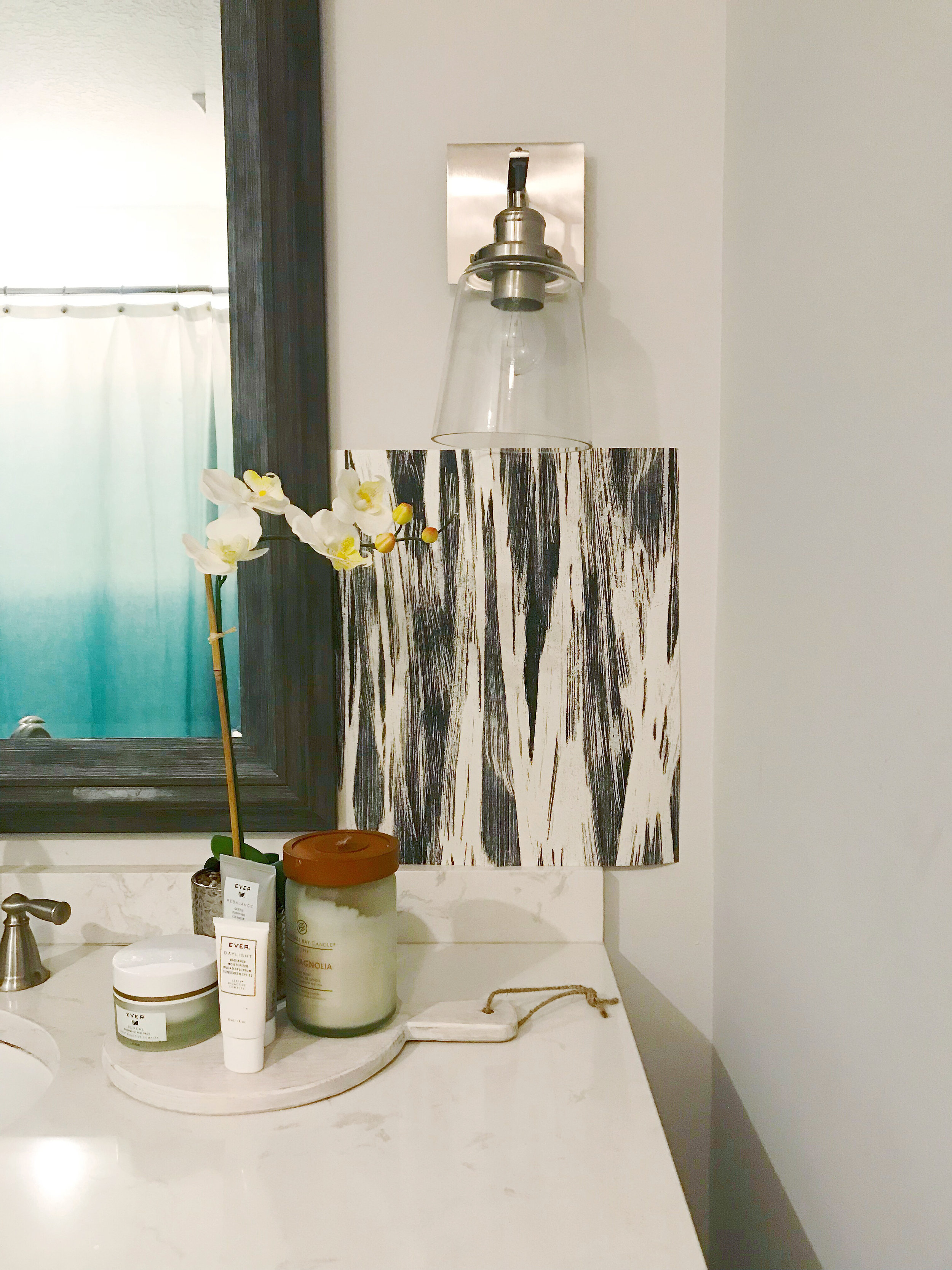
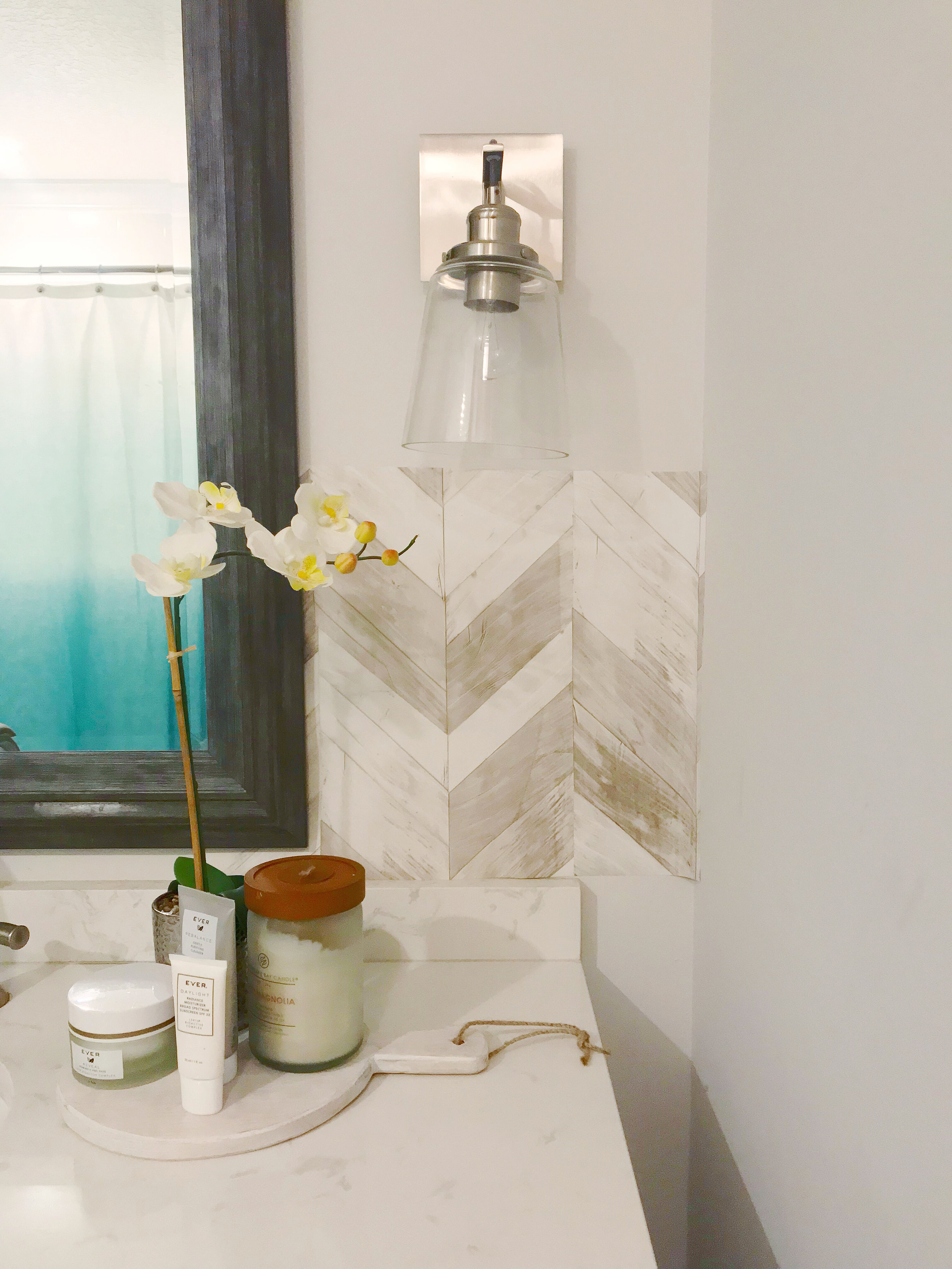
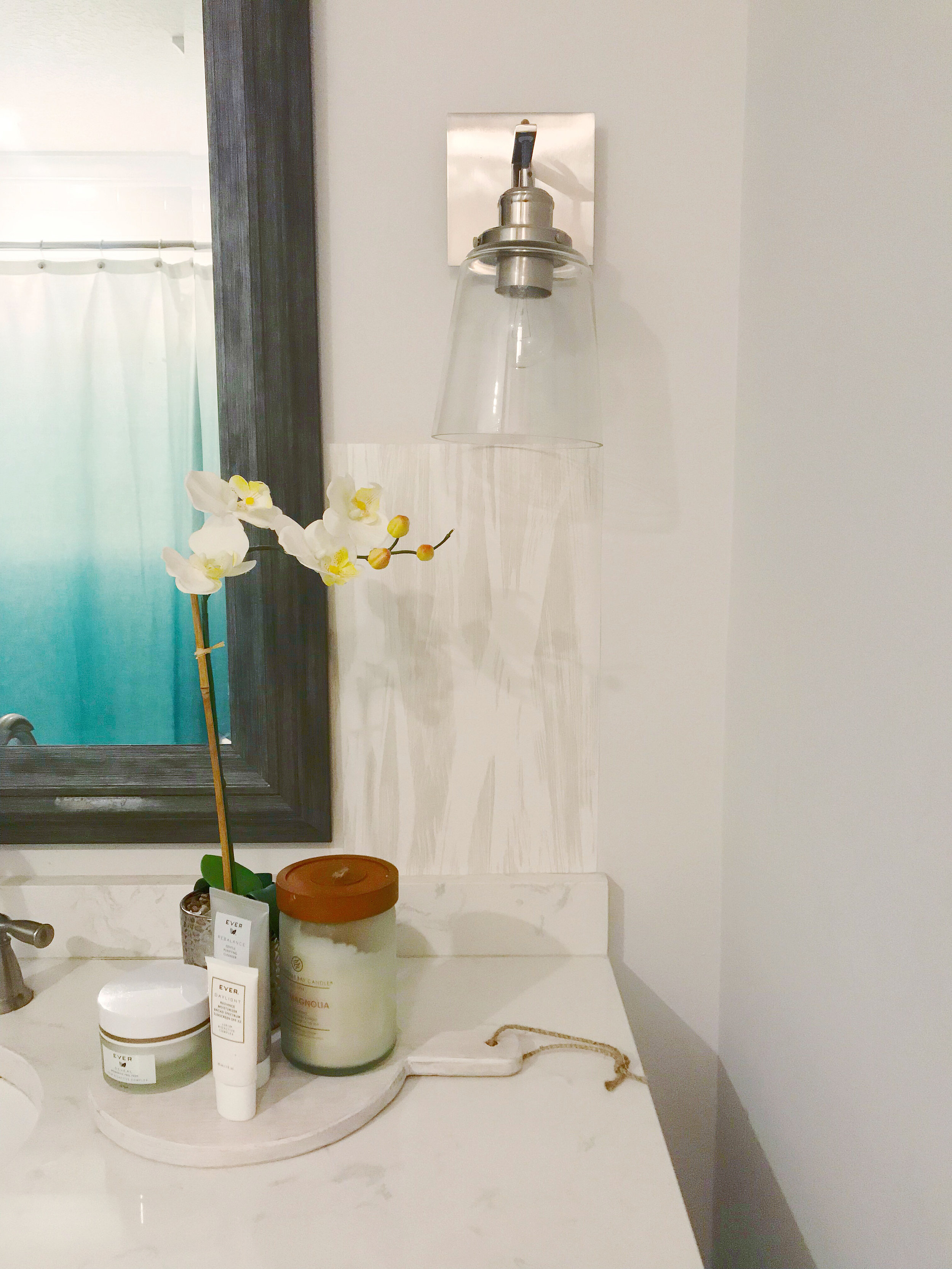
A few years ago I collaborated with Walls Republic on my office design. I’m a fan of the right wallpaper in the right space, I’m actually obsessed with cute wallpaper. I’m excited to have the opportunity to collaborate with them on this project as well! I picked out a few samples that I liked and they sent them my way. I taped them up on the wall… what do you think about them? I have a favorite in mind, but want to see what you guys think too! What is your favorite?!
White Kitchen Renovation
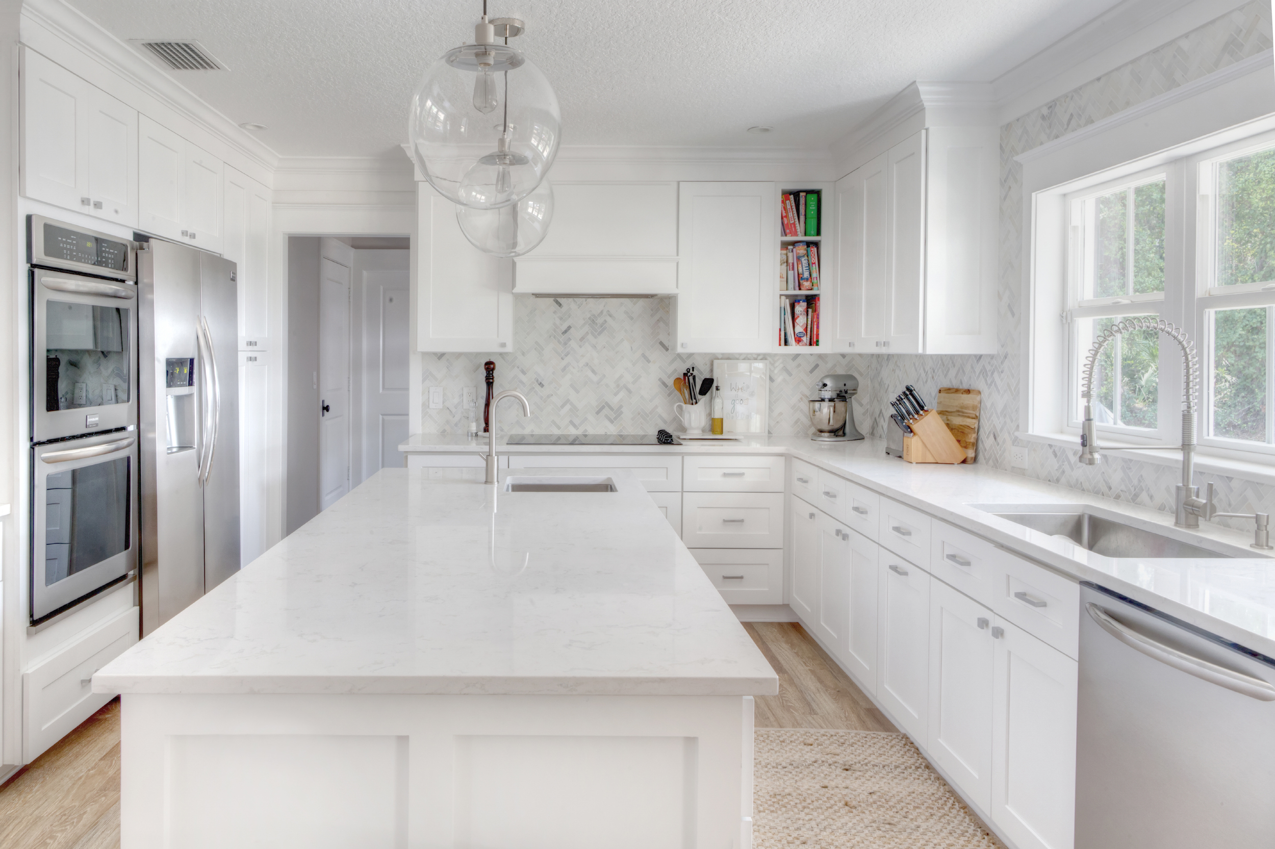
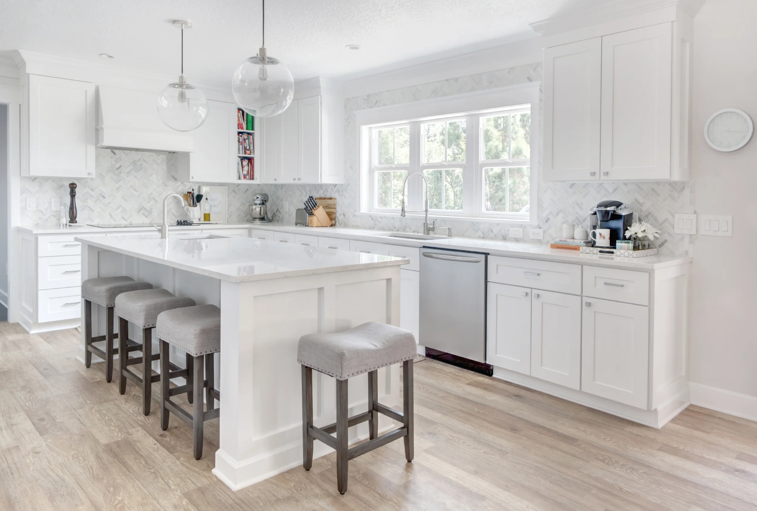
My kitchen. I’m in love with it. I’m STILL in love with it after living here for three and a half years. In our old house we had a really small kitchen with black granite countertops. I loved the look of black when I picked it out building our first house, but it made the kitchen so DARK.
My kitchen. I’m in love with it. I’m STILL in love with it after living here for three and a half years. In our old house we had a really small kitchen with black granite countertops. I loved the look of black when I picked it out building our first house, but it made the kitchen so DARK. I knew when we were renovating our new house that I wanted the kitchen as big and as light and bright as possible. I added more windows and picked out Cambria quartz countertops, the color is Torquay.
Want to see the drastic before and after?! Check this out!
The flooring is from Home Depot’s Home Decorator’s Collection and I LOVE it. The stools are from Target and the faucet’s are by Danze. All of our appliances are from the Frigidaire Gallery Collection. Our cabinet are by J&K Cabinetry from Ultimate Cabinet Supplies in Roseland, and the knobs and pulls are from Home Depot. Here is a link to the amazing backsplash from Lowes, it’s SO pretty and reasonable too!
Home Office Design
My office! Well I guess I can say “our office” since Steve does use the secretary as his desk. This was a catch-all space for awhile before Steve’s recording studio was finished. We had our desks, random furniture, musical instruments and more in here. As soon as he was able to move all of his stuff out I got to work on the room!
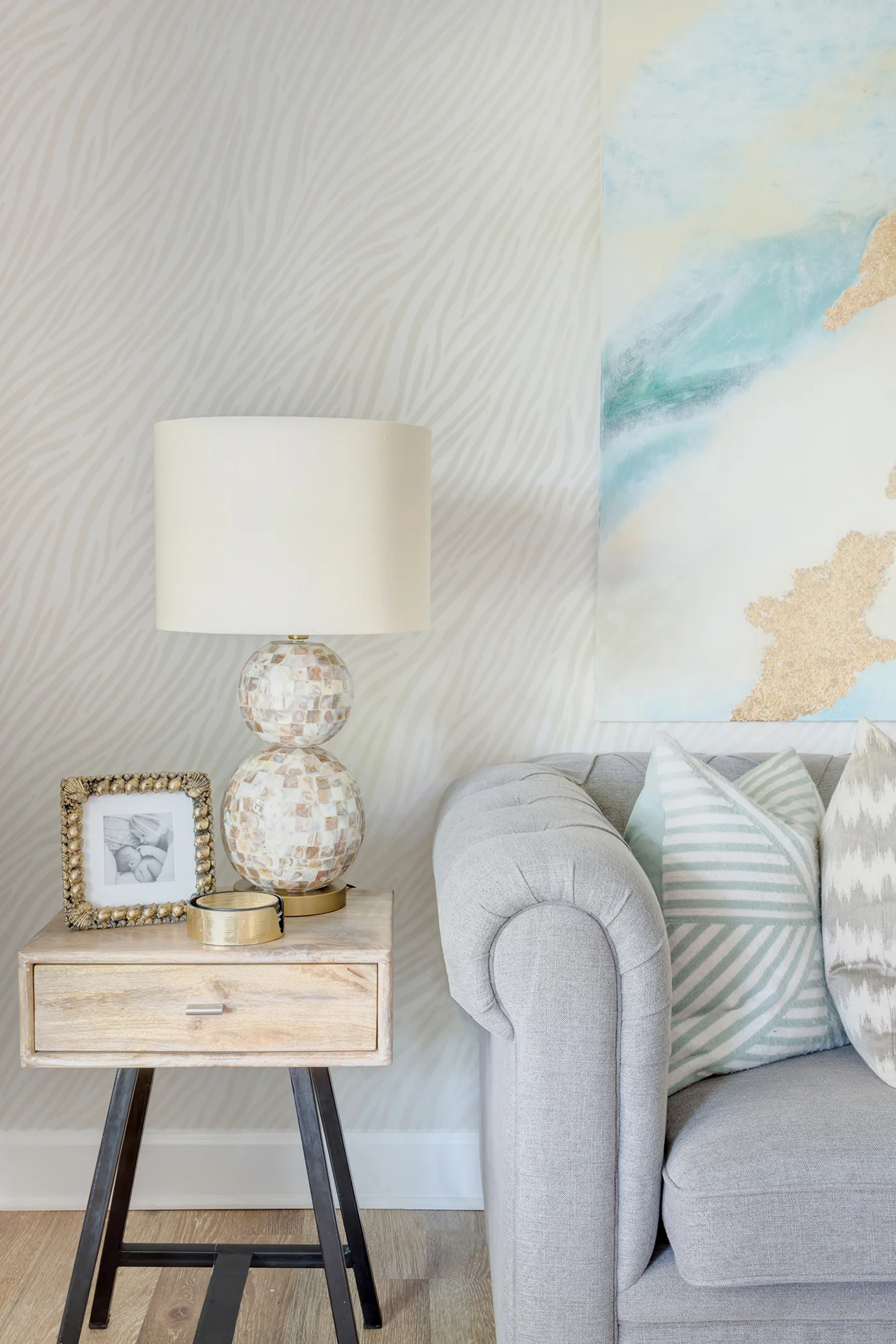
My office! Well I guess I can say “our office” since Steve does use the secretary as his desk. This was a catch-all space for awhile before Steve’s recording studio was finished. We had our desks, random furniture, musical instruments and more in here. As soon as he was able to move all of his stuff out I got to work on the room! So as you look past the dining room when you walk in the front door, you look directly at the wall with the sofa. I wanted it to be visually appealing of course, but I wanted to be unique too since it is such a focal point. I thought wallpaper would be an amazing finish on this wall and when Walls Republic approached me about collaborating I was ALL IN. I was able to pick out a bunch of samples and if you follow me on Instagram you probably saw me trying to select one! I decided to go with this Ivory Zebra for a few reasons:
1) I’m all about keeping spaces light and bright! The walls are darker in this room than anywhere else and I didn’t want a heavy or contrasty pattern to suck any more light away!
2) In real life, it shimmers. Yeah, it’s almost like a slight glitter. Obsessed.
3) The texture! I love how subtle but how beautiful the paper is. I ended up hanging a painting I made above the sofa and I think it’s a really nice focal point for the room!
I like that we both have workspaces but it doesn’t feel like an “office” per se. It’s functional, but most importantly it’s pretty!
And because it’s fun to see a true before and after… here’s our office BEFORE we renovated, they used this space as a dining room!
Wallpaper: Walls Republic | Sofa & Coffee Table: Urban Outfitters – Sofa & Coffee Table | Desk: World Market | Desk Chairs & End Tables: Homegoods | Lamps: Lamps Plus | Pillows & Accessories: Homegoods & Bealls Outlet
Neutral Master Bedroom
Well one by one I’m getting these rooms photographed for the “afters.” Here are a few of our bedroom! I must say I’m pretty addicted to surrounding myself with neutrals, love these greys and creams together with a little black and gold. I’m still undecided whether or not I’m going to add draperies to the windows behind the nightstands. I bought the rods and panels but I really like how “clean” it looks right now… so I’m letting it simmer. What do you think? (After seeing the first pic, all I can think is that I need a new bedskirt!)
Well one by one I’m getting these rooms photographed for the “afters.” Here are a few of our bedroom! I must say I’m pretty addicted to surrounding myself with neutrals, love these greys and creams together with a little black and gold. I’m still undecided whether or not I’m going to add draperies to the windows behind the nightstands. I bought the rods and panels but I really like how “clean” it looks right now… so I’m letting it simmer. What do you think? (After seeing the first pic, all I can think is that I need a new bedskirt!)
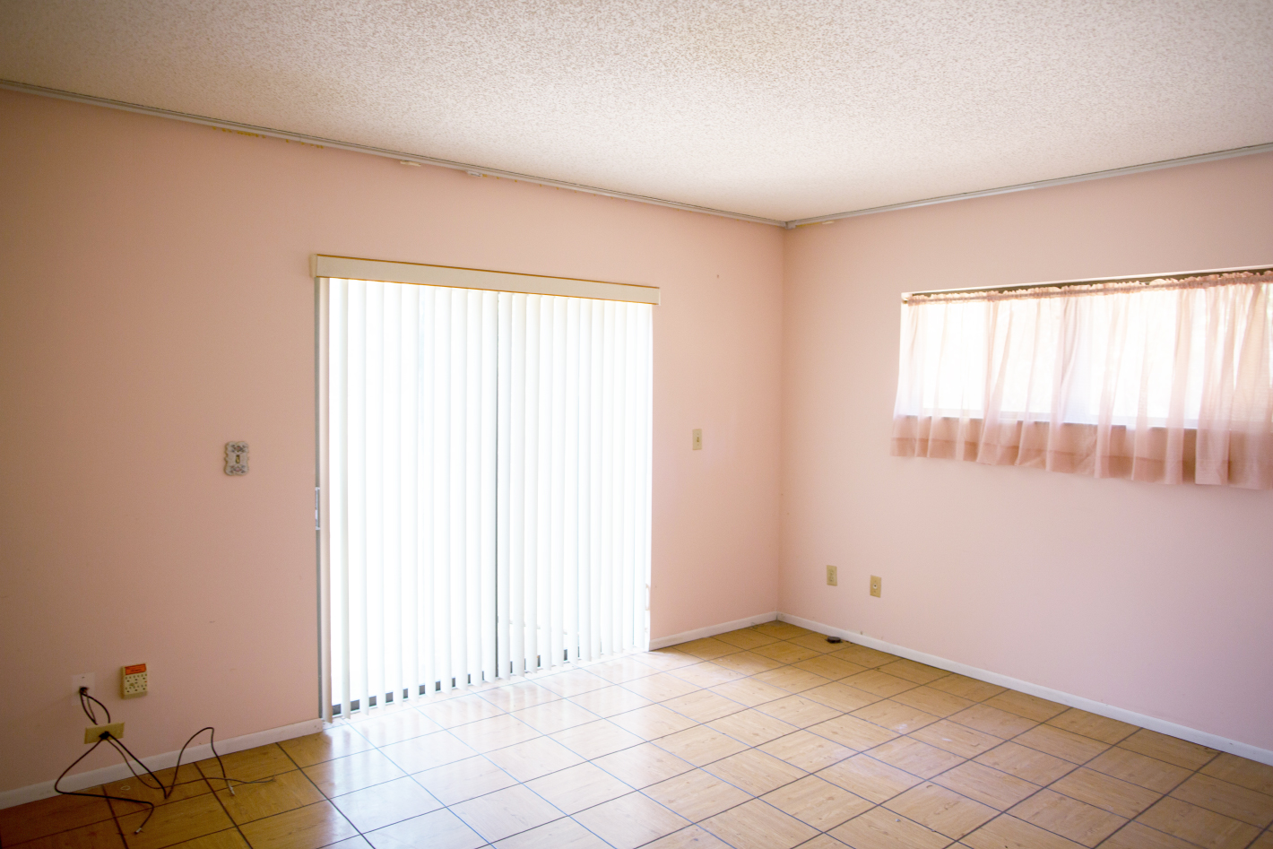
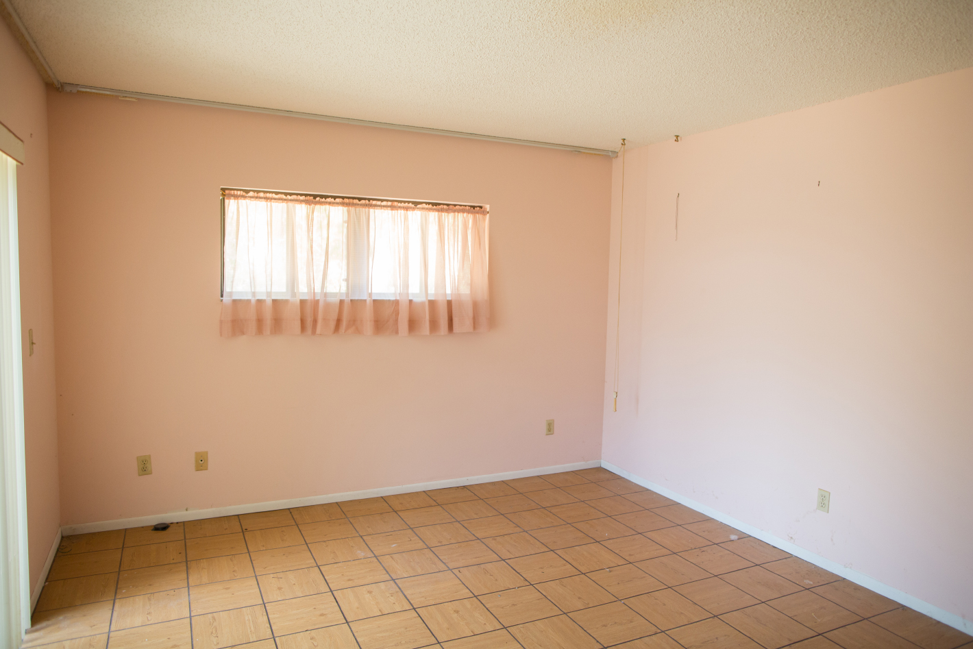
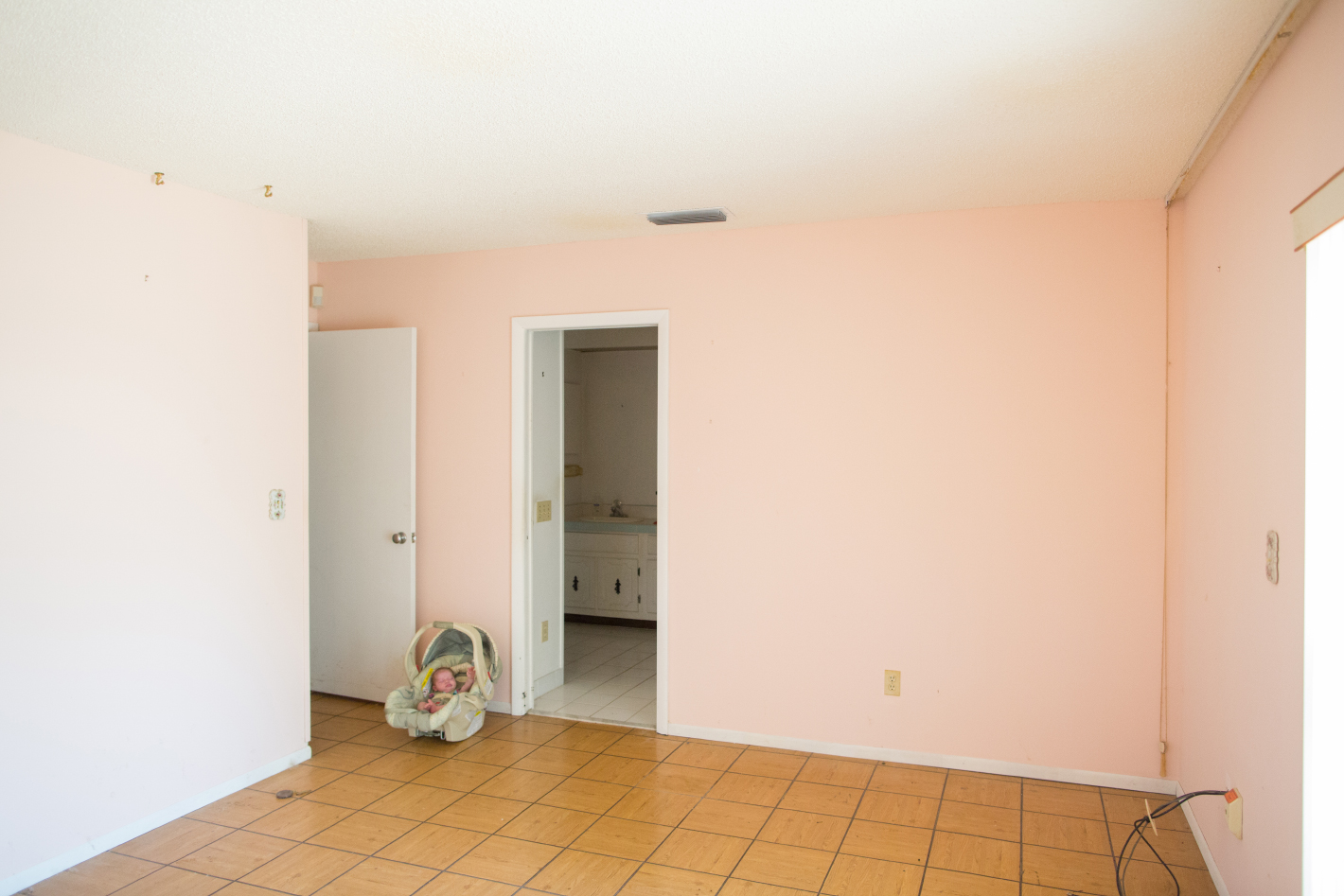
And we can’t forget to mention the beautiful before design to full appreciate the after right?! Pink & parquet tile and that weird tall height window! We also made the room a little bigger, just a couple feet made a huge difference!


