Neutral Dining Room
This summer I decided to take on a project… photographing the rooms in my house I haven’t shared yet! If you didn’t know, we renovated this house a few years back. It was a pretty big undertaking but I love our location - right around the corner from where I grew up and where my parents still live, our property - wood acreage that is rare to find in town, and our house - designed by myself and renovated by my Dad’s company.
This summer I decided to take on a project… photographing the rooms in my house I haven’t shared yet! If you didn’t know, we renovated this house a few years back. It was a pretty big undertaking but I love our location - right around the corner from where I grew up and where my parents still live, our property - wood acreage that is rare to find in town, and our house - designed by myself and renovated by my Dad’s company.
Our living, kitchen and dining room are all open to each other. We use our dining room every night (that we eat at home) and I love that. It’s not a formal space that collects dust. It’s the family table where we not only share meals, it’s where homework is done, where puzzles are put together, where games are played and where laughter is shared.
I wanted to keep the space beachy but neutral with a touch of farmhouse. The chairs and chandelier are from Ballard Designs and the table is from a local furniture company.
And if you’re curious about what the space looked like before… check out these pics! Quite the difference right? It’s hard to believe this is the same space!
Home Office Design
My office! Well I guess I can say “our office” since Steve does use the secretary as his desk. This was a catch-all space for awhile before Steve’s recording studio was finished. We had our desks, random furniture, musical instruments and more in here. As soon as he was able to move all of his stuff out I got to work on the room!
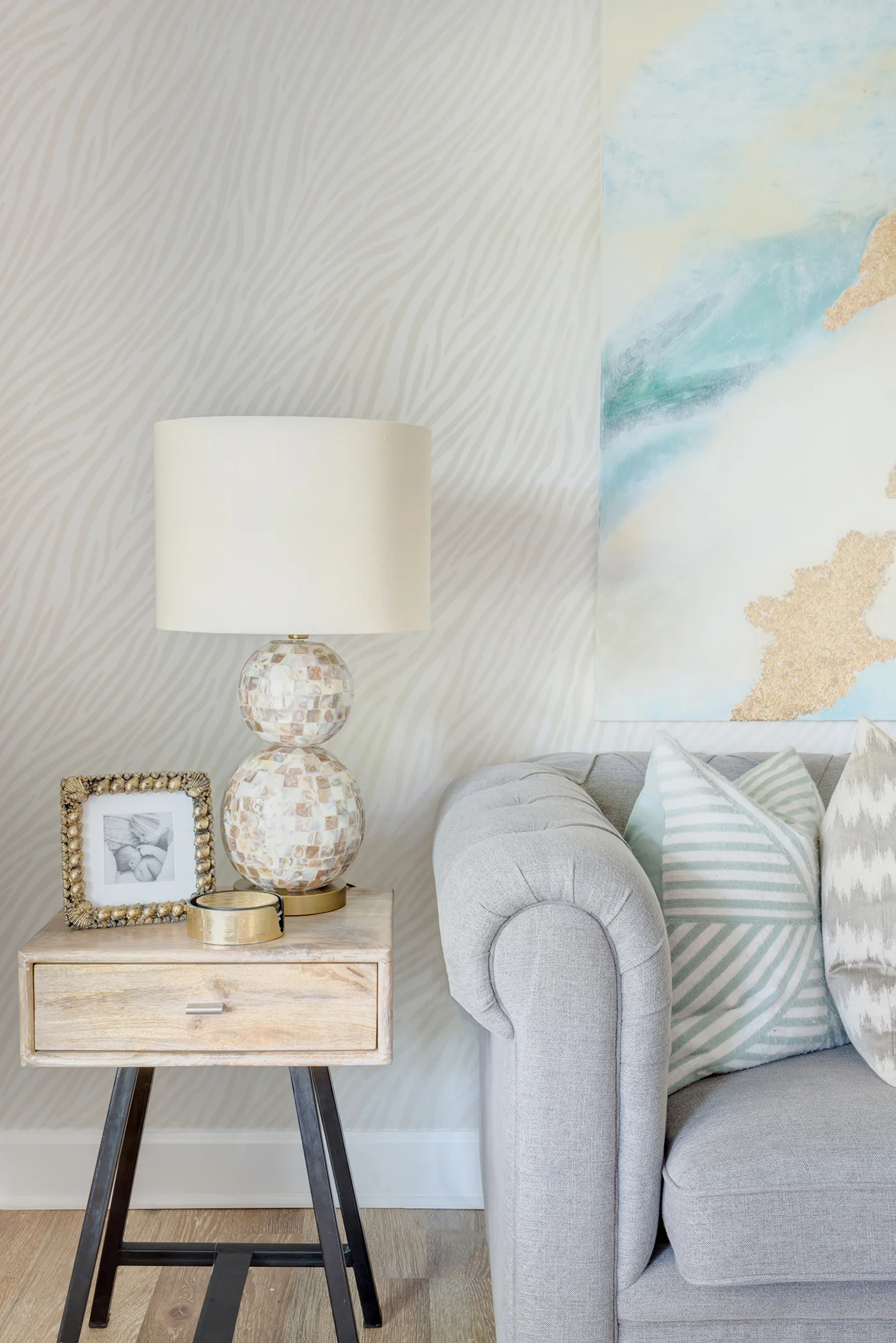
My office! Well I guess I can say “our office” since Steve does use the secretary as his desk. This was a catch-all space for awhile before Steve’s recording studio was finished. We had our desks, random furniture, musical instruments and more in here. As soon as he was able to move all of his stuff out I got to work on the room! So as you look past the dining room when you walk in the front door, you look directly at the wall with the sofa. I wanted it to be visually appealing of course, but I wanted to be unique too since it is such a focal point. I thought wallpaper would be an amazing finish on this wall and when Walls Republic approached me about collaborating I was ALL IN. I was able to pick out a bunch of samples and if you follow me on Instagram you probably saw me trying to select one! I decided to go with this Ivory Zebra for a few reasons:
1) I’m all about keeping spaces light and bright! The walls are darker in this room than anywhere else and I didn’t want a heavy or contrasty pattern to suck any more light away!
2) In real life, it shimmers. Yeah, it’s almost like a slight glitter. Obsessed.
3) The texture! I love how subtle but how beautiful the paper is. I ended up hanging a painting I made above the sofa and I think it’s a really nice focal point for the room!
I like that we both have workspaces but it doesn’t feel like an “office” per se. It’s functional, but most importantly it’s pretty!
And because it’s fun to see a true before and after… here’s our office BEFORE we renovated, they used this space as a dining room!
Wallpaper: Walls Republic | Sofa & Coffee Table: Urban Outfitters – Sofa & Coffee Table | Desk: World Market | Desk Chairs & End Tables: Homegoods | Lamps: Lamps Plus | Pillows & Accessories: Homegoods & Bealls Outlet
Neutral Master Bedroom
Well one by one I’m getting these rooms photographed for the “afters.” Here are a few of our bedroom! I must say I’m pretty addicted to surrounding myself with neutrals, love these greys and creams together with a little black and gold. I’m still undecided whether or not I’m going to add draperies to the windows behind the nightstands. I bought the rods and panels but I really like how “clean” it looks right now… so I’m letting it simmer. What do you think? (After seeing the first pic, all I can think is that I need a new bedskirt!)
Well one by one I’m getting these rooms photographed for the “afters.” Here are a few of our bedroom! I must say I’m pretty addicted to surrounding myself with neutrals, love these greys and creams together with a little black and gold. I’m still undecided whether or not I’m going to add draperies to the windows behind the nightstands. I bought the rods and panels but I really like how “clean” it looks right now… so I’m letting it simmer. What do you think? (After seeing the first pic, all I can think is that I need a new bedskirt!)
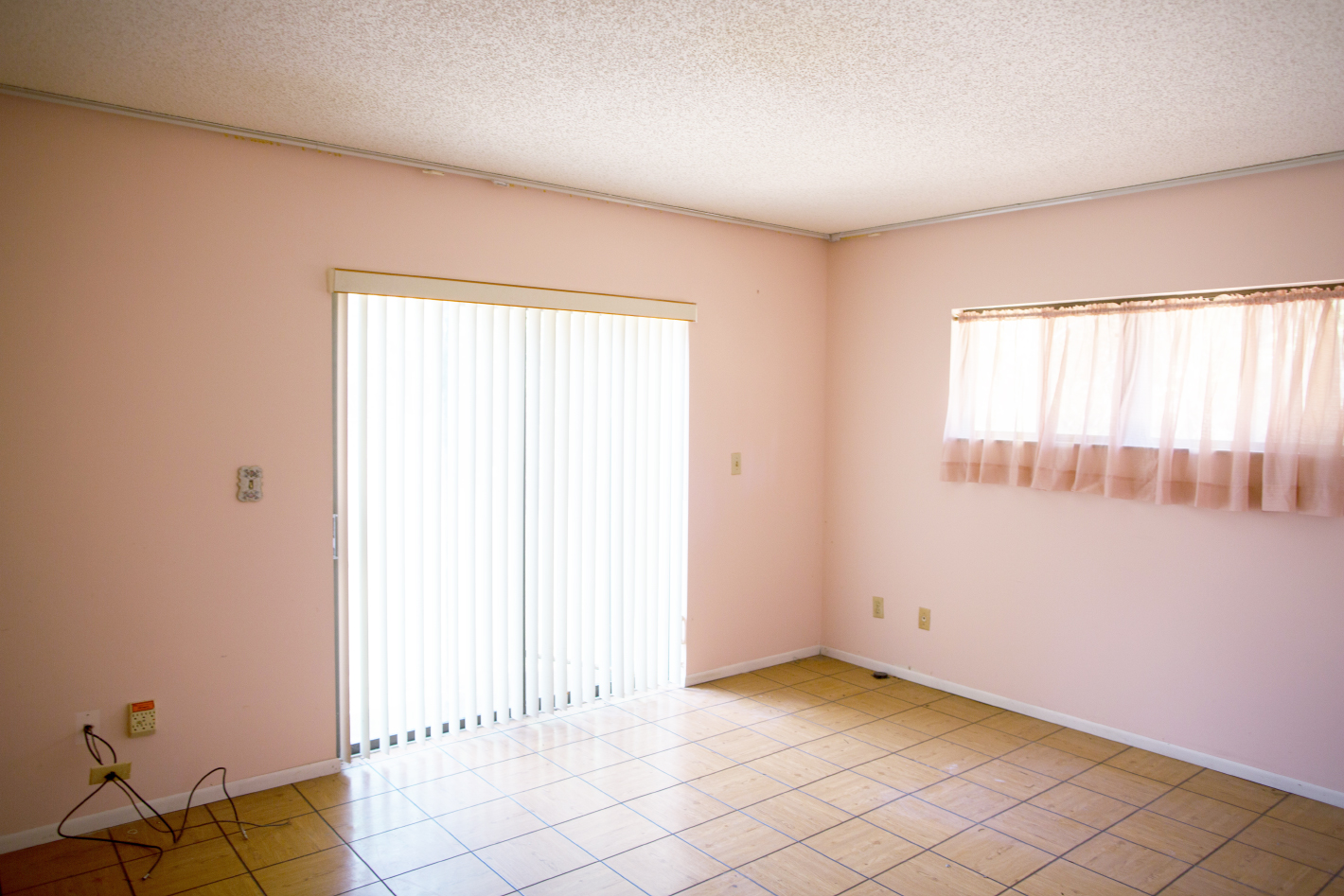
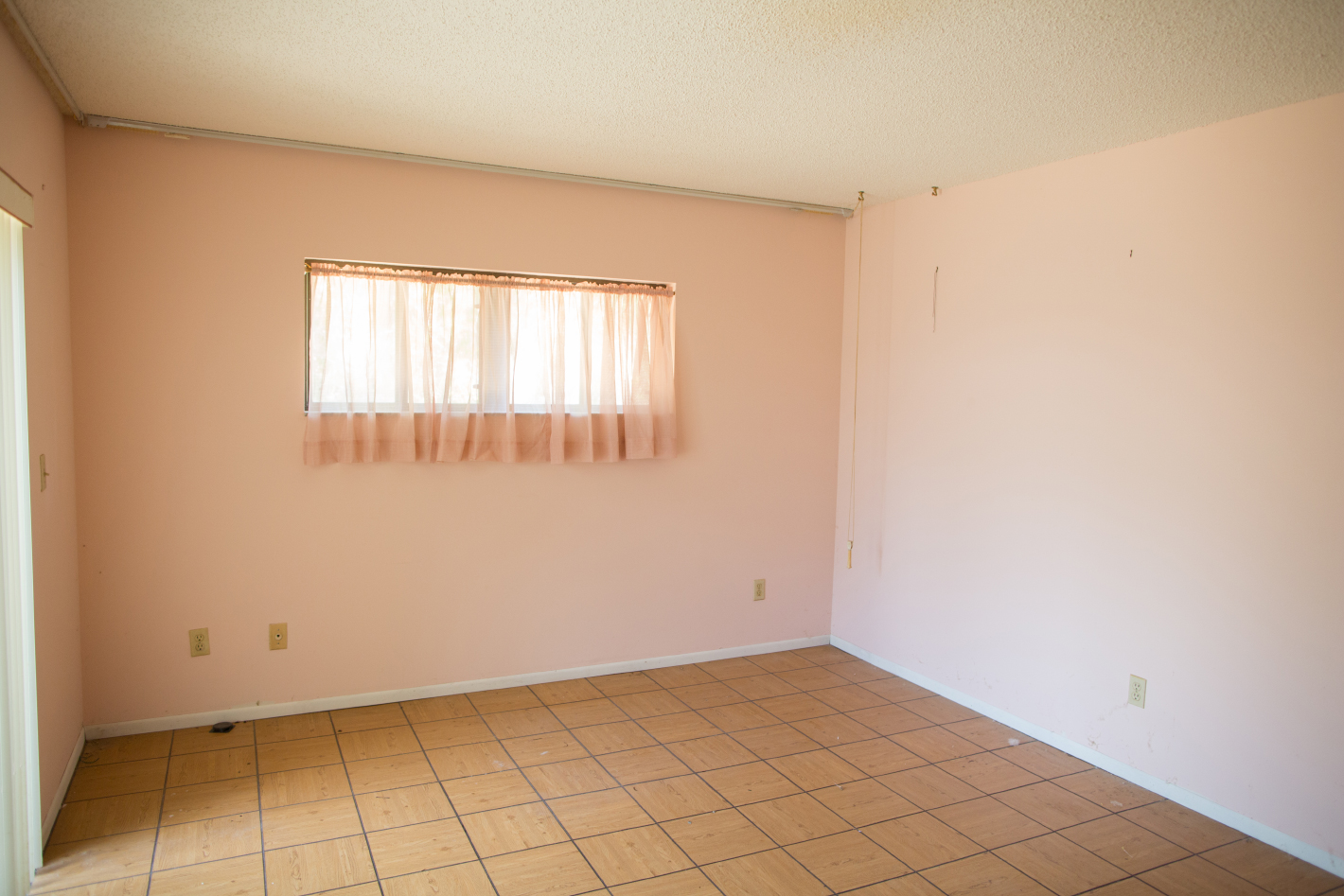
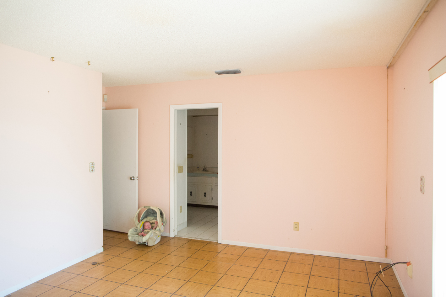
And we can’t forget to mention the beautiful before design to full appreciate the after right?! Pink & parquet tile and that weird tall height window! We also made the room a little bigger, just a couple feet made a huge difference!


